


- Destroy this mad brute Poster
- The good neighbor of South America Poster
- Italy with Vatican City Poster
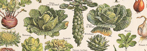
- Radishes Poster
- Carrots Poster
- Campari Soda Poster
- Bec-Kina Poster
- Kohler Chocolat Poster
- Strawberry Thief Poster
- Tom Krojer Exhibition Poster Poster
- Berlin Street Scene Poster
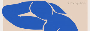
- Woman Seated Back Poster
- Park Near Lu Poster
- El Comienzo Poster
- Parler Seul Poster
- Faun and Nymphe Poster
- Female Artist Poster
- Visit Puerto Rico Poster
- The Jefferson Airplane Poster
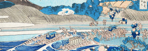
- Kyushu-Okinawa Poster
- Xerez Pedro Domeco Poster
- Continental Hawaii Airline Poster
- Beer and Cigarette Poster
- West Coast of Mexico Poster
- El Maestro 1 Poster
- Cannabis Plate 2 Poster
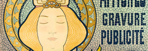
- L'Art Independant Poster
- Swing into books Poster
- Mexican Art & Life 1 Poster
- Mexican Art & Life 4 Poster
- Mexican Art & Life 3 Poster
- The Ornamental Arts Of Japan IX Poster
- Joyful Mountain Poster
- Prunus avium Poster
-
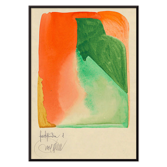
Farbstudien, 10 Blätter I Poster
Karl Wiener · 1923 · Energetic abstract poster balancing orange and green forms on warm beige
Poster from €9 · Framed from €16
Regular price From €6,00Regular price -
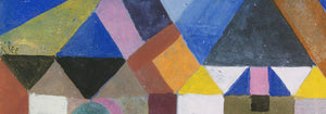
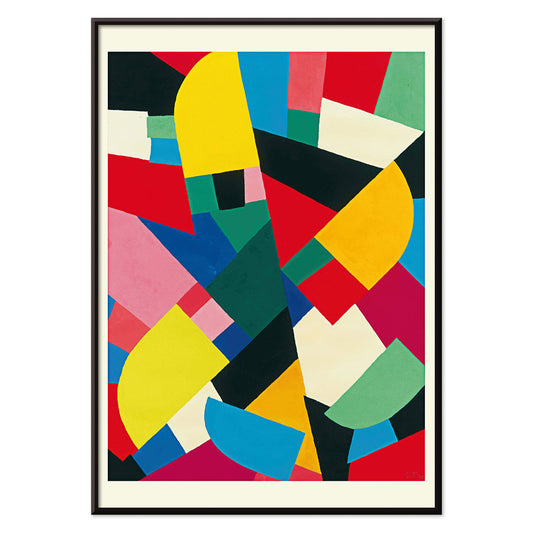
Color Patchwork Poster
Otto Freundlich · 1936 · Vibrant abstract poster of interlocking color tiles unified by bold black outlines
Poster from €9 · Framed from €16
Regular price From €6,00Regular price -
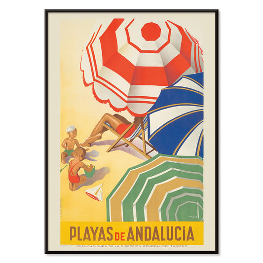
Playas de Andalucia Poster
José Morell · 1939 · Vibrant Andalusian beach poster featuring sunbathers, blue sea, boats, and bold lettering
Poster from €9 · Framed from €16
Regular price From €6,00Regular price -
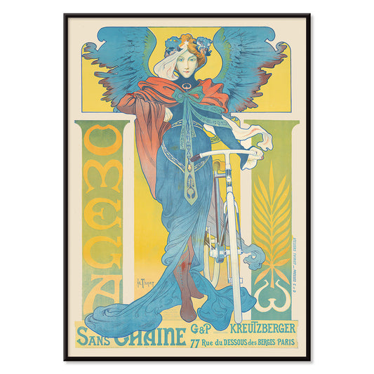
Omega Poster
Henri Thiriet · 1897 · Art Nouveau bicycle poster featuring a winged woman against bold blue tones
Poster from €9 · Framed from €16
Regular price From €6,00Regular price -
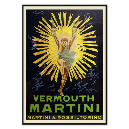
Vermouth Martini Poster
Leonetto Cappiello · 1920 · Vibrant Vermouth Martini poster featuring a yellow-costumed figure on a dramatic black background
Poster from €9 · Framed from €16
Regular price From €6,00Regular price -
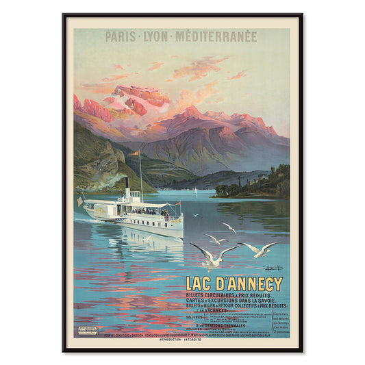
Le Lac d’Annecy Poster
Frederic Hugo d Alesi · 1900 · Serene Lake Annecy travel poster with sunset light, mountains, and reflective water
Poster from €9 · Framed from €16
Regular price From €6,00Regular price -
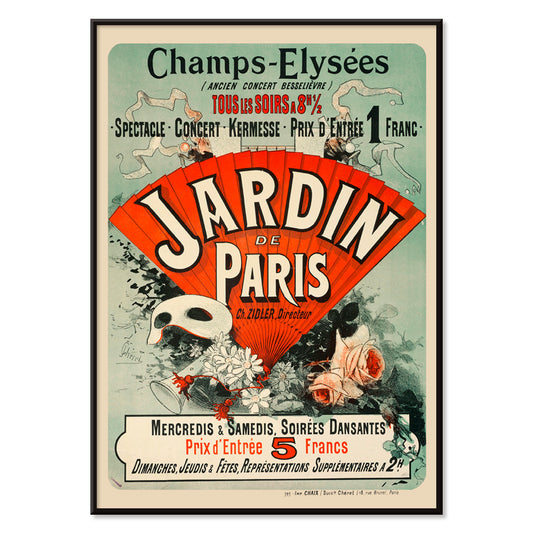
Jardin De Paris Poster
Jules Chéret · 1884 · Joyful Belle Époque poster with a swirling dancer, masks, and confetti like florals
Poster from €9 · Framed from €16
Regular price From €6,00Regular price -
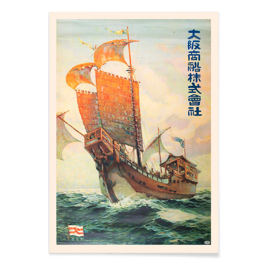
Ōsaka Shōsen Kabushiki Kaisha Poster
Unknown artist · 1920 · Vintage Japanese shipping poster featuring a stylized Red-Seal ship and bold blue waves
Poster from €9 · Framed from €16
Regular price From €6,00Regular price -
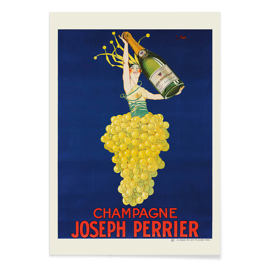
Champagne Joseph Perrier Poster
Joseph Stall · 1902 · Festive champagne poster with elegant figure and swirling grape motifs in vivid colors
Poster from €9 · Framed from €16
Regular price From €6,00Regular price -
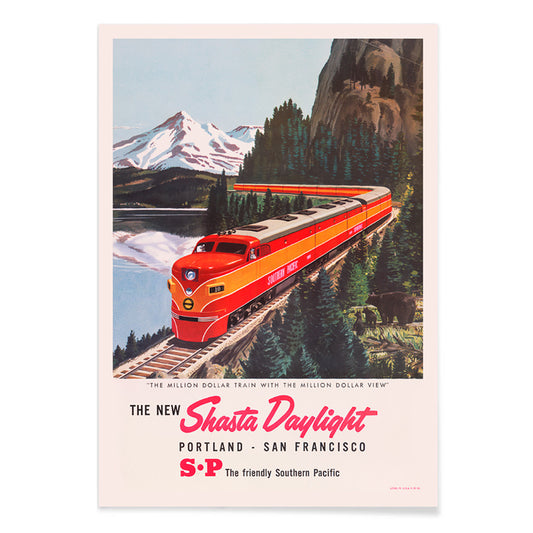
The new Shasta Daylight Poster
Unknown artist · 1950 · Streamlined red train poster curving through mountain scenery in crisp mid-century graphics
Poster from €9 · Framed from €16
Regular price From €6,00Regular price -
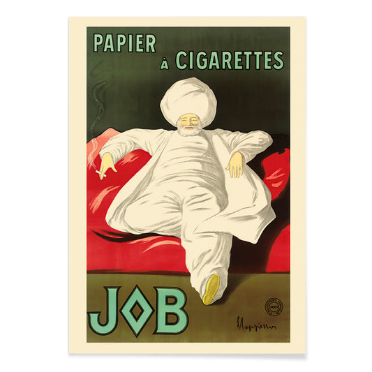
Rolling Paper Job Poster
Leonetto Cappiello · 1933 · Elegant advertising poster featuring a white-robed figure on vivid green
Poster from €9 · Framed from €16
Regular price From €6,00Regular price -
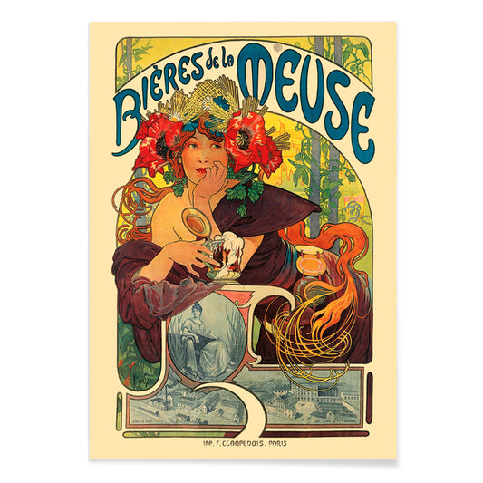
Bières De La Meuse Poster
Alphonse Mucha · 1897 · Radiant Art Nouveau beer poster featuring a flower-crowned muse and swirling hair
Poster from €9 · Framed from €16
Regular price From €6,00Regular price -
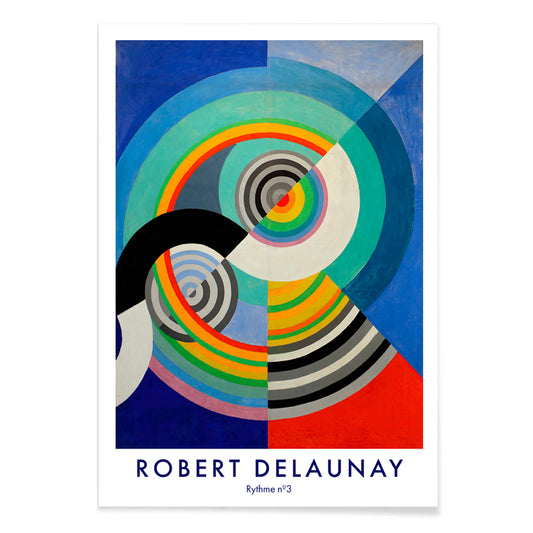
Rythme n°3 Poster
Robert Delaunay · 1938 · Energetic abstract poster of concentric circles pulsing in blue, red, yellow, and green
Poster from €9 · Framed from €16
Regular price From €6,00Regular price -
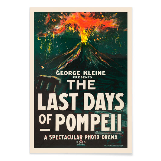
The Last Days of Pompeii Poster
H.C. Miner · 1913 · Dramatic volcano eruption movie poster with bold lettering and glowing orange smoke
Poster from €9 · Framed from €16
Regular price From €6,00Regular price -
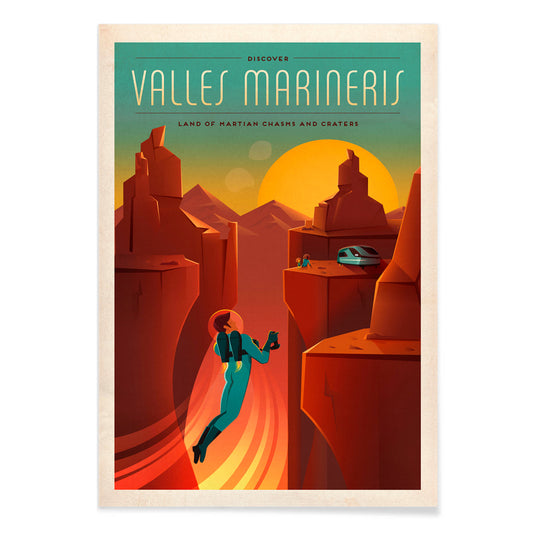
Valles Marineris Poster
SpaceX · 2015 · Vintage inspired Martian canyon poster featuring an astronaut silhouette at sunset
Poster from €9 · Framed from €16
Regular price From €6,00Regular price -
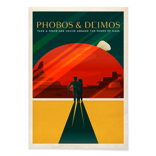
Phobos & Deimos Poster
SpaceX · 2020 · Retro Mars travel poster featuring a couple beneath Phobos and Deimos in red tones
Poster from €9 · Framed from €16
Regular price From €6,00Regular price -
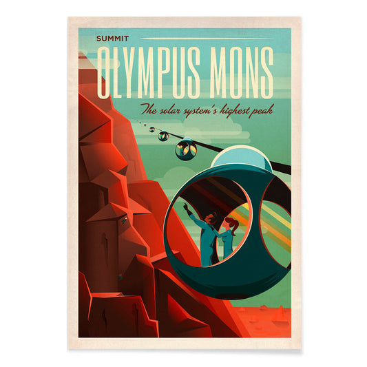
Olympus Mons Poster
SpaceX · 2021 · Retrofuturist Mars travel poster showing cable cars climbing the red slopes of Olympus Mons
Poster from €9 · Framed from €16
Regular price From €6,00Regular price -
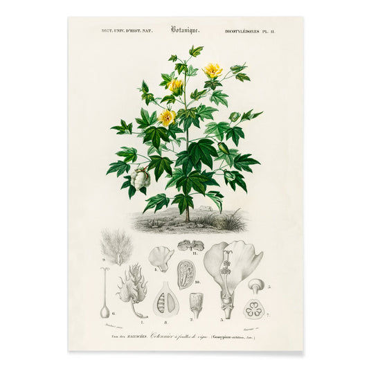
Gossypium Vitifolium Poster
Charles Dessalines D Orbigny · 1849 · Delicate Sea Island cotton botanical print with lobed leaves, pale blossoms, and bolls
Poster from €9 · Framed from €16
Regular price From €6,00Regular price -
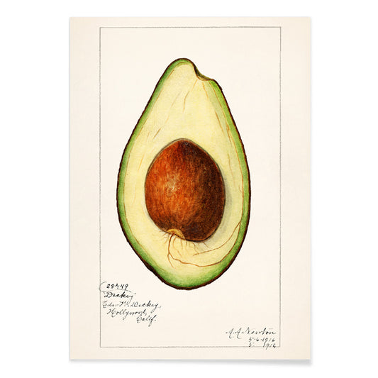
Avocado Persea Poster
Amanda Almira Newton · 1916 · Detailed avocado botanical print with cut fruit, large seed, and glossy leaves
Poster from €9 · Framed from €16
Regular price From €6,00Regular price -
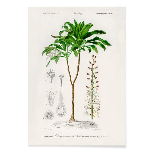
Dracaena brasiliensis Poster
Charles Dessalines D Orbigny · 1841 · Elegant Dracaena botanical print with arching strap leaves and a clean specimen layout
Poster from €9 · Framed from €16
Regular price From €6,00Regular price -
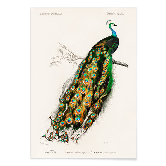
Pavo Cristatus Poster
Charles Dessalines D Orbigny · 1849 · Elegant Indian peafowl print with jewel toned plumage and refined natural history detail
Poster from €9 · Framed from €16
Regular price From €6,00Regular price -
Perruche Poster
Charles Dessalines d Orbigny · 1806 · Lively parakeet print with perched birds and crisp natural history detail
Poster from €9 · Framed from €16
Regular price From €6,00Regular price -
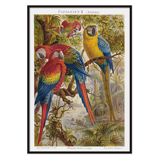
Parrots II Poster
Institut of Leipzig · 2012 · Lush parrot print featuring three macaws perched on tropical branches
Poster from €9 · Framed from €16
Regular price From €6,00Regular price -
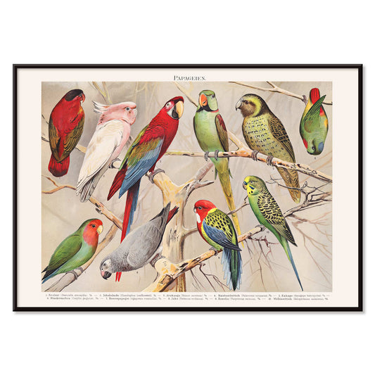
Parrots I Poster
Institut of Leipzig · 1972 · Vibrant parrot print arranged like a natural history plate with crisp scientific detail
Poster from €9 · Framed from €16
Regular price From €6,00Regular price -
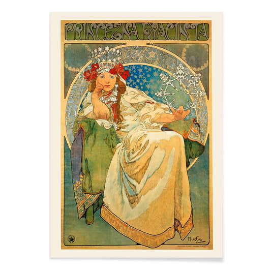
Princezna Hyacinta Poster
Alfons Mucha · 1911 · Elegant Art Nouveau poster of a crowned princess framed by floral ornament
Poster from €9 · Framed from €16
Regular price From €6,00Regular price -
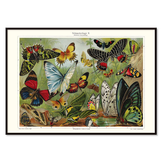
Butterflies II Poster
Institut of Leipzig · 1971 · Vintage butterfly poster featuring colorful specimens arranged in a precise educational display
Poster from €9 · Framed from €16
Regular price From €6,00Regular price -
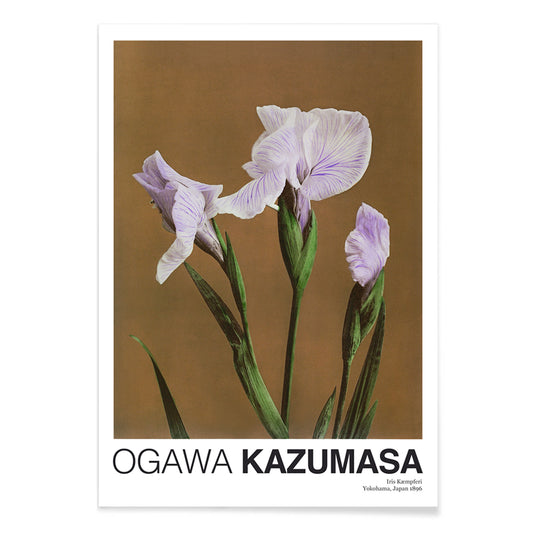
Iris Kæmpferi Poster
Ogawa Kazumasa · 1896 · Hand-colored iris botanical print with slender green leaves and soft purple petals
Poster from €9 · Framed from €16
Regular price From €6,00Regular price -
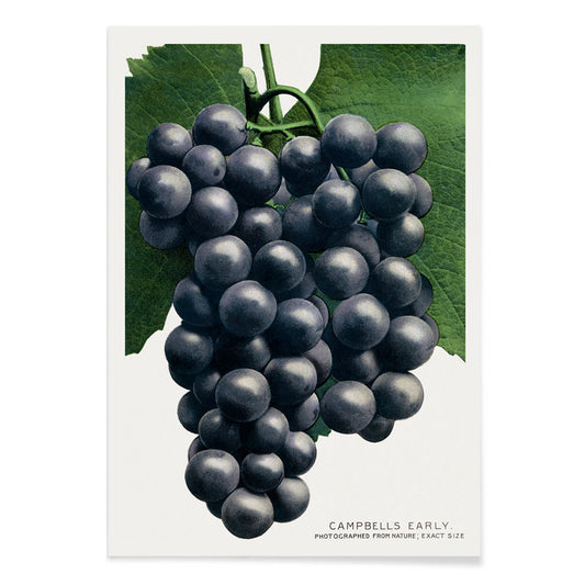
Campbell's Early Grape Poster
Rochester Lithographing and Printing Company · 1895 · Lush botanical print of purple grape clusters framed by crisp green vine leaves
Poster from €9 · Framed from €16
Regular price From €6,00Regular price -
Lotus Flowers Poster
Ogawa Kazumasa · 1892 · Serene lotus flower print blending soft pink blooms with calm blue water
Poster from €9 · Framed from €16
Regular price From €6,00Regular price -
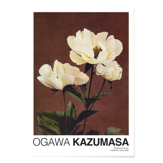
Hærdaceous Peony Poster
Ogawa Kazumasa · 1896 · Serene botanical print of white peony blossoms with deep green leaves on cream
Poster from €9 · Framed from €16
Regular price From €6,00Regular price -
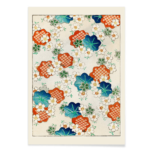
Floral pattern Poster
Watanabe Seitei · 1895 · Elegant floral pattern print with crisp outlines and airy negative space
Poster from €9 · Framed from €16
Regular price From €6,00Regular price -
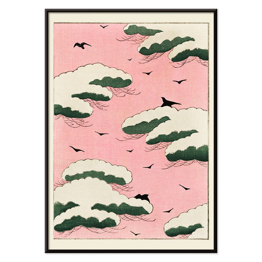
Pink sky Poster
Watanabe Seitei · 1895 · Airy sky-and-birds poster with soft pink haze and floating green cloud forms
Poster from €9 · Framed from €16
Regular price From €6,00Regular price -
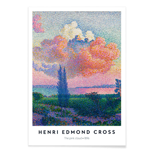
The Pink Cloud Poster
Henri-Edmond Cross · 1896 · Pointillist coastal art print with a radiant pink cloud above calm blue water
Poster from €9 · Framed from €16
Regular price From €6,00Regular price -
Five storks in a meadow Poster
Theo van Hoytema · 1898 · Serene stork print in a meadow balancing airy linework with soft greens
Poster from €9 · Framed from €16
Regular price From €6,00Regular price -
Boon Poster
Johann Georg van Caspel · 1904 · Art Nouveau poster of a woman reading framed by flowing florals
Poster from €9 · Framed from €16
Regular price From €6,00Regular price -
Capi Poster
Johann Georg van Caspel · 1912 · Elegant Art Nouveau poster featuring a woman with a camera and bold blue accents
Poster from €9 · Framed from €16
Regular price From €6,00Regular price


36/704 items
- Farbstudien, 10 Blätter I Poster
- Color Patchwork Poster
- Playas de Andalucia Poster
- Vermouth Martini Poster
- Le Lac d’Annecy Poster
- Jardin De Paris Poster
- Champagne Joseph Perrier Poster
- The new Shasta Daylight Poster
- Rolling Paper Job Poster
- Rythme n°3 Poster
- The Last Days of Pompeii Poster
- Valles Marineris Poster
- Phobos & Deimos Poster
- Olympus Mons Poster
- Lotus Flowers Poster
- Pink sky Poster
- The Pink Cloud Poster
- Boon Poster
Why green keeps returning
Green in vintage poster culture is rarely a single hue; it works as a punctuation mark, chlorophyll against cream paper, emerald shadows in a lithograph, a muted olive that softens a room. From 19th-century verdigris to mid-century inks, green signaled gardens, hygiene, and new leisure. This is a color-led way to build wall art and decoration, moving easily between botanical and abstract, without forcing everything to match.
Pattern, pigment, and a little science
Designers have long used green to make surfaces feel alive. In Eugène Chevreul’s Cercle chromatique, the spectrum is laid out like a tidy argument: greens bloom between yellow and blue, then dissolve into cooler notes. That logic shaped 19th-century taste, from painters’ palettes to dyed textiles. Chevreul’s ideas traveled through poster studios, where lithographers layered translucent greens to suggest depth without heavy shading, an approach that made small green details capable of anchoring an entire composition.
How craft traditions use green
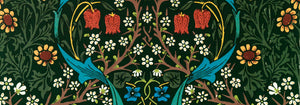
Ornament and repeat pattern give green a different job: not accent, but environment. William Morris turns theory into domestic structure in Strawberry Thief (1883) by William Morris, where birds and curling leaves lock into a repeat that feels both medieval and modern. Seen beside related work in William Morris and the broader context of classic art, the poster becomes a lesson in how green can hold busy drawing together without flattening it.
Where green wall art works hardest
In a kitchen or dining corner, green reads as appetite and freshness; pair it with matte ceramics and warm woods, or echo it with herbs on the counter. In bedrooms, choose dusty sage or forest tones to quiet bright lighting, then let linen and brass do the rest. For a restrained gallery wall, start with green-accented pieces and add neutrals from black and white; the contrast keeps the decoration from tipping into a theme. Entryways like a sharper green at eye level, while a living room can handle layered greens across two or three prints.
Curating across eras and framing choices
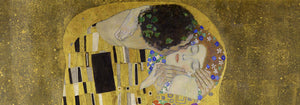
Green also bridges styles. Gustav Klimt’s The Kiss (1907–1908) by Gustav Klimt carries a deep, garden-like green that keeps the gold mosaic grounded; hang it near dark walnut or moss velvet for a softer glow. For airier calm, try the dusk gradients and river reflections of Early Autumn in Urayasu (1931) by Kawase Hasui, then connect it to panoramic companions from landscape or the wider world of oriental prints. When you want graphic punch, Hans Schleger’s Eat Greens for Health by Hans Schleger sits naturally beside advertising and bauhaus posters, where green often acts as a calm counterweight to red or black. Treat framing as part of the palette: pale oak for herbal charts, black for modern geometry, and a slim brass edge when the design already carries metallic warmth.