


You may also like
-
Familiar colors Poster
Marcius Willson · 1890 · Educational color chart poster featuring geometric squares and triangles in vivid primary colors
Poster from €9 · Framed from €16
Regular price From €6,00Regular price -
Economical use of plants Poster
Marcius Willson · 1865 · Detailed botanical chart poster mapping practical plant uses in crisp labeled vignettes
Poster from €9 · Framed from €16
Regular price From €6,00Regular price -
Forms of leaves Poster
Marcius Willson · 1890 · Educational leaf anatomy print with labeled forms and gentle green botanical tones
Poster from €9 · Framed from €16
Regular price From €6,00Regular price -
Peinture et Teinture Poster
Claude Augé · 1908 · Educational color chart poster pairing French labels with orderly pigment swatches
Poster from €9 · Framed from €16
Regular price From €6,00Regular price


-

"Very nice Posters. The quality is amazing and we received it very quickly !"
-

"A shop to visit absolutely. Huge selection of posters. We spent more than an hour there !"
-

"Perfect to find gift. Price are very good. An they can frame and pack it on site"


About the Artist
Marcius Willson was an American educator and textbook author whose influential works shaped the way science and art were taught in the late nineteenth century. He believed in using clear, systematic visuals to make complex concepts accessible to students of all ages. Willson’s approach reflected a broader educational movement that valued practical learning tools in classrooms and studios.
This 1890 educational chart exemplifies his commitment to clarity and utility, serving as a reference for teachers, artists, and students. It stands alongside other science wall art that bridges the gap between knowledge and visual engagement.
The Artwork
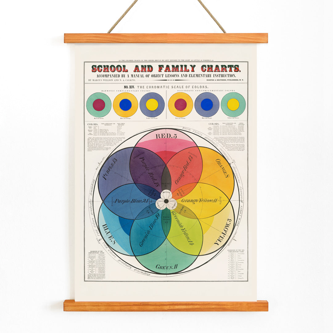
The Chromatic scale of colors was created during a period when educators and designers sought to standardize the language of color. This chart provided a common framework for discussing hue, tint, and harmony, essential for teaching drawing, painting, and printing. By offering a visual system, it helped both students and professionals make informed creative decisions based on shared principles rather than subjective taste.
As a vintage educational tool, it embodies the era’s belief in the intersection of art and science, making color theory accessible and practical for everyday use in classrooms and studios.
Style & Characteristics
The chart features a central color wheel, meticulously divided into labeled segments that display a full chromatic spectrum. Its concentric layout and precise, serif typography evoke the clarity and order of a scientific diagram. The palette includes vivid reds, blues, yellows, greens, and purples, arranged in a harmonious sequence that is both visually striking and instructive.
The geometric structure and disciplined color transitions give the piece a quietly modern feel, making it a natural companion to abstract wall art and early twentieth-century design movements like Bauhaus.
In Interior Design
This color theory chart brings energy and sophistication to offices, creative studios, and learning spaces. Its informative yet decorative presence makes it ideal for gallery walls featuring design references or educational memorabilia.
Displayed in a simple frame against white or light-toned walls, the print stands out as a crisp focal point. Its vintage appeal complements minimalist, mid-century, and contemporary interiors that value both color and clarity.