


You may also like
-
Up-to-date map of the world war Poster
Manila Shinbun-sha · 1942 · Detailed world war map poster with color coded routes and lively hand drawn icons
Poster from €9 · Framed from €16
Regular price From €6,00Regular price -
Japan the target Poster
Ernest Dudley Chase · 1942 · Dynamic WWII map poster centering Japan with target motif and bold cartographic icons
Poster from €9 · Framed from €16
Regular price From €6,00Regular price -
Army Orientation Course Poster
F.E. Manning · 1940 · WWII instructional poster featuring a globe map and bold Target Berlin motif in blue
Poster from €9 · Framed from €16
Regular price From €6,00Regular price -
British Overseas Airways Poster
Seymour E.O. · 1949 · Colorful BOAC world routes poster with sweeping lines across a stylized globe
Poster from €9 · Framed from €16
Regular price From €6,00Regular price


-

"Very nice Posters. The quality is amazing and we received it very quickly !"
-

"A shop to visit absolutely. Huge selection of posters. We spent more than an hour there !"
-

"Perfect to find gift. Price are very good. An they can frame and pack it on site"


About the Artist
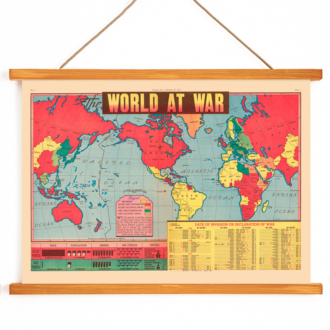
Created by an anonymous artist, this 1942 map is rooted in the era’s wartime cartography, when visual communication became essential for public awareness. During World War II, such maps were widely distributed in newspapers, schools, and offices, helping people grasp the shifting alliances and territories that defined the conflict.
This historical poster print reflects a time when information design was not only practical but also persuasive, shaping public understanding and morale. Collectors value these 1940s world war maps for their blend of graphic clarity and historical significance, offering a window into how societies processed global events.
The Artwork
World at War was created at a moment when the outcome of World War II remained uncertain, and the need for accessible information was urgent. The map’s primary function was to clarify the complex web of alliances, occupied regions, and strategic fronts, serving as both a teaching tool and a political statement.
Displayed in homes, schools, and workplaces, the map helped viewers make sense of daily headlines and global developments. Its role extended beyond information—it fostered a sense of collective awareness and engagement with world affairs during a turbulent period.
Style & Characteristics
The map features a large, central world map bordered by clear labels, boundary lines, and a detailed legend. Distinct color-coded zones differentiate territories, while oceans and polar regions provide visual relief. The use of bold primary colors and high-contrast blocks ensures immediate readability and impact.
The crisp, declarative visual language is characteristic of 1940s informational graphics, emphasizing clarity and urgency. For more graphic cartography, explore our vintage map prints and other horizontal posters with strong editorial design.
In Interior Design
This WWII map poster is ideal for a study, office, or library where historical reference and conversation are valued. It also anchors a gallery wall when paired with documentary photography, travel memorabilia, or archival documents, lending structure and visual interest.
Complement it with mid-century woods, black metal frames, or neutral textiles to let the map’s vivid colors stand out. Its bold palette works especially well alongside red-toned wall art and other graphic pieces for a cohesive, informed interior.