


- Destroy This Mad Brute Poster
- Shaw ou Ironia Poster
- Les Lalanne Poster
- Punch Boutique Poster
- Ponto de vista sobre o judaísmo e o paganismo Poster
- Jet Clipper para o Hawaii Poster
- Campari Soda Poster
- Bec-Kina Poster
- Cena de Rua de Berlim Poster
- Exposição de Ernst Kirchner Poster
- Tour Eiffel 2 Poster
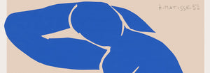
- Mulher Sentada de Costas Poster
- Parque perto de Lu Poster
- El Comienzo Poster
- Parler Seul 2 Poster
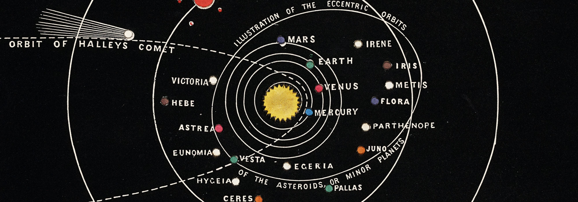
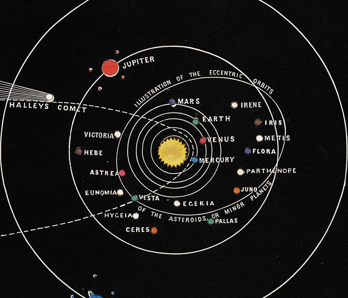
- Posição Atual dos Mahatmas Poster
- Anel do Crepúsculo Poster
- Parler Seul Poster
- The Dream Poster
- Le Concert Poster
- Pássaro atravessando uma nuvem Poster
- Artista Feminina Poster
- Revenge of the Pink Panther Poster
- Mulher e Pássaro à Noite Poster
- Riley Blaze Poster
- Almanaque Poster
- Bauhaus 20 Poster
- Bauhaus 21 Poster
- Coma mais frutas Poster
- Grou japonês azul Poster
- Snoopy Come Home Poster
- Para Londres por Jet Clipper Poster
- La Paresse Poster
- Xerez Pedro Domecq Poster
- Balsam Aperitif Poster
- Crans-sur-Sierre Poster
-
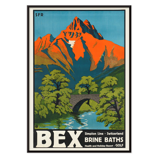
Banhos Salinos de Bex Poster
Aimé-Félix Nicollerat · 1896 · Poster de estação termal alpina com ponte de pedra, rio caudaloso e picos radiantes
Poster desde €9 · Emoldurado desde €16
Preço normal A partir de €6,00Preço normal -
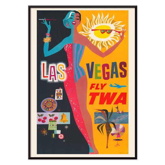
Las Vegas – Voe TWA Poster
David Klein · 1962 · Vibrante poster de Las Vegas com dançarina, néons e elegância TWA
Poster desde €9 · Emoldurado desde €16
Preço normal A partir de €6,00Preço normal -
Osen Poster
Komura Settai · 1934 · Cena de chuva serena em poster com figuras sob wagasa em tons de tinta esparsa
Poster desde €9 · Emoldurado desde €16
Preço normal A partir de €6,00Preço normal -
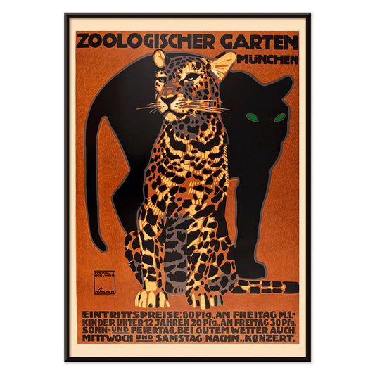
Zoologischer Garten Poster
Ludwig Hohlwein · 1912 · Impactante poster do zoo de Munique com grande felino riscado e tipografia nítida
Poster desde €9 · Emoldurado desde €16
Preço normal A partir de €6,00Preço normal -
Souvenirs das Minhas Viagens Poster
Kawase Hasui · 1940 · Sereno poster costeiro com caverna em falésias escuras sobre rebentação luminosa
Poster desde €9 · Emoldurado desde €16
Preço normal A partir de €6,00Preço normal -
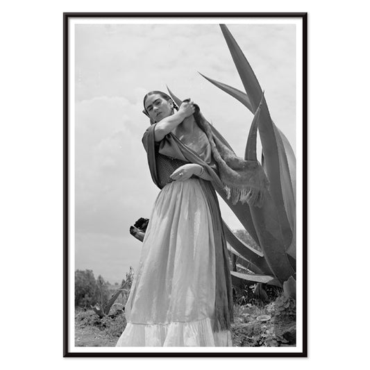
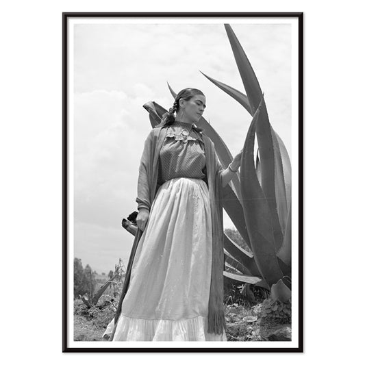
Frida Kahlo junto a um agave Poster
Toni Frissell · 1937 · Poster icónico preto e branco de Frida Kahlo junto a um agave marcante
Poster desde €9 · Emoldurado desde €16
Preço normal A partir de €6,00Preço normal -
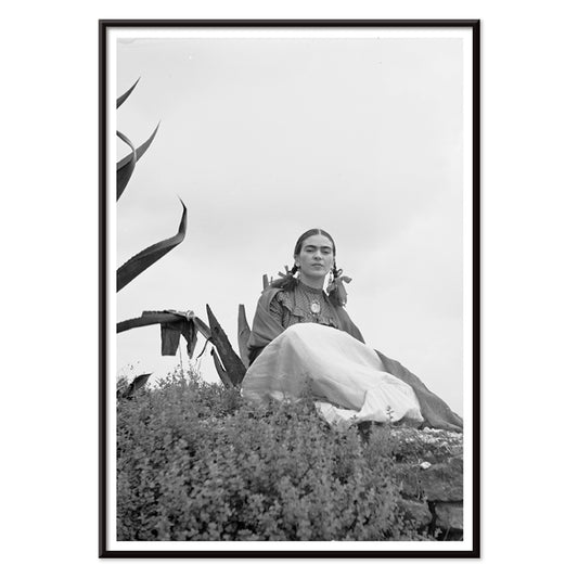
Frida Kahlo sentada junto a um agave Poster
Toni Frissell · 1937 · Impactante poster a preto e branco de Frida Kahlo sentada junto a um agave
Poster desde €9 · Emoldurado desde €16
Preço normal A partir de €6,00Preço normal -
Marquês de Tavistock Poster
Toni Frissell · 1955 · Elegante poster a preto e branco que evoca o glamour das Bermudas
Poster desde €9 · Emoldurado desde €16
Preço normal A partir de €6,00Preço normal -
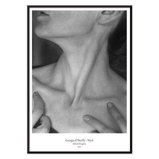
Georgia O'Keeffe - Pescoço Poster
Alfred Stieglitz · 1921 · Íntima impressão artística a preto e branco que recorta pescoço e maxilar em abstração escultórica
Poster desde €9 · Emoldurado desde €16
Preço normal A partir de €6,00Preço normal -
Frida Kahlo junto a um agave Poster
Toni Frissell · 1937 · Icónico poster a preto e branco de Frida Kahlo junto a um agave monumental
Poster desde €9 · Emoldurado desde €16
Preço normal A partir de €6,00Preço normal -
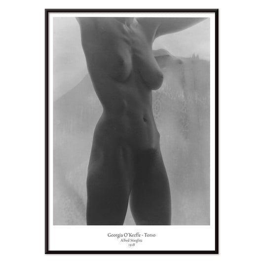
Torso de Georgia O'Keeffe Poster
Alfred Stieglitz · 1918 · Poster a preto e branco do torso recortado pela luz suave e intimidade modernista
Poster desde €9 · Emoldurado desde €16
Preço normal A partir de €6,00Preço normal -
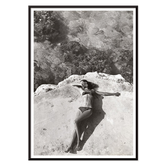
Nickerson Paine de biquíni Poster
Toni Frissell · 1971 · Poster a preto e branco de biquíni com composição solar à beira-mar e contraste nítido
Poster desde €9 · Emoldurado desde €16
Preço normal A partir de €6,00Preço normal -
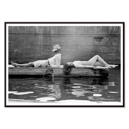
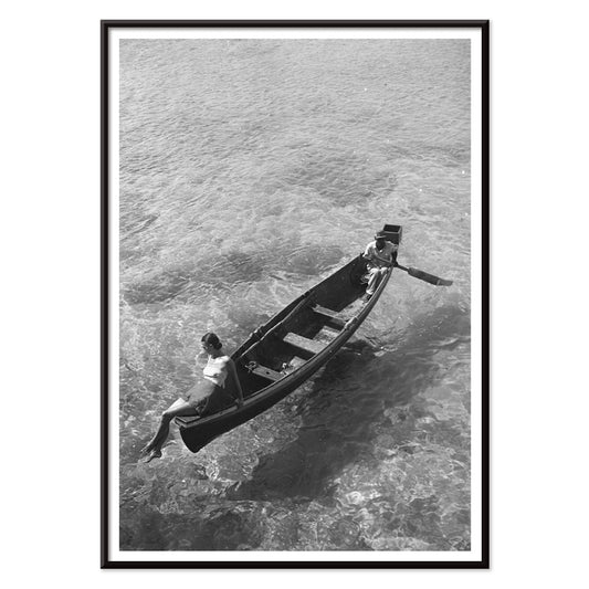
Modelo de moda à beira do barco Poster
Toni Frissell · 1946 · Elegante poster a preto e branco de uma modelo sentada na beira de um barco
Poster desde €9 · Emoldurado desde €16
Preço normal A partir de €6,00Preço normal -
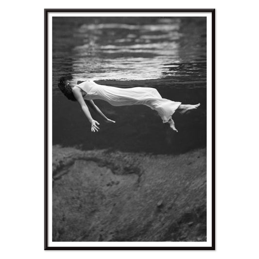
Modelo de moda submersa Poster
Toni Frissell · 1947 · Impressionante impressão artística subaquática com modelo flutuante em preto e branco luminoso
Poster desde €9 · Emoldurado desde €16
Preço normal A partir de €6,00Preço normal -
Nascente de Weeki Wachee Poster
Toni Frissell · 1947 · Onírico poster subaquático em preto e branco com figura flutuante luminosa
Poster desde €9 · Emoldurado desde €16
Preço normal A partir de €6,00Preço normal -
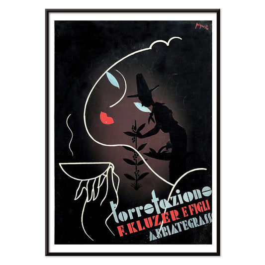
Torrefazione F. Kluzer Poster
Carlo Piquillo Pandolfi · 1930 · Poster Art Deco italiano com motivo de chávena e blocos geométricos de cor
Poster desde €9 · Emoldurado desde €16
Preço normal A partir de €6,00Preço normal -
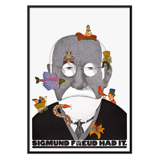
Sigmund Freud tinha razão Poster
Seymour Chwast · 1970 · Poster espirituoso de Freud com tipografia pop e símbolos surreais em verde e laranja
Poster desde €9 · Emoldurado desde €16
Preço normal A partir de €6,00Preço normal -
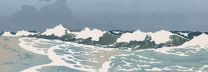
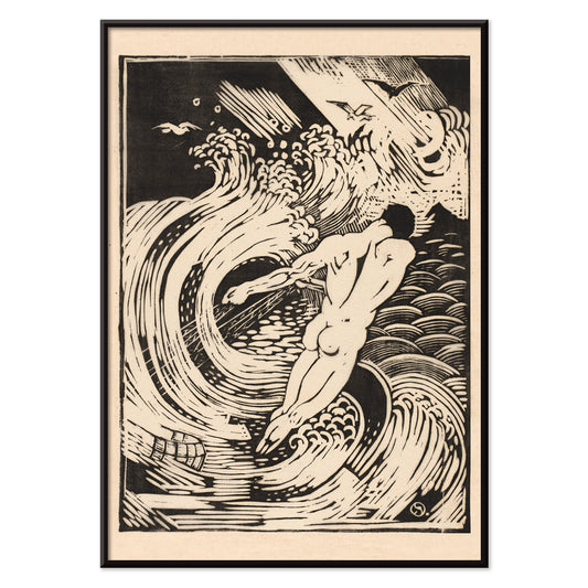
O pescador Poster
Henri van der Stok · 1900 · Dramático poster a preto e branco com mergulhador nu entre ondas turbulentas
Poster desde €9 · Emoldurado desde €16
Preço normal A partir de €6,00Preço normal -
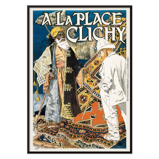
À la Place Clichy Poster
Eugène Grasset · 1891 · Poster Art Nouveau de Paris com mulher elegante e paleta azul‑laranja vibrante
Poster desde €9 · Emoldurado desde €16
Preço normal A partir de €6,00Preço normal -
Jager Poster
Henri van der Stok · 1880 · Imponente poster a preto e branco com figura de caçador em folhagem densa
Poster desde €9 · Emoldurado desde €16
Preço normal A partir de €6,00Preço normal -
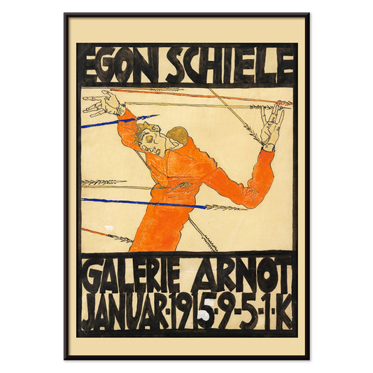
Exposição Schiele na Galerie Arnot Poster
Egon Schiele · 1915 · Poster expressionista de exposição com figura angular e acento laranja marcante
Poster desde €9 · Emoldurado desde €16
Preço normal A partir de €6,00Preço normal -
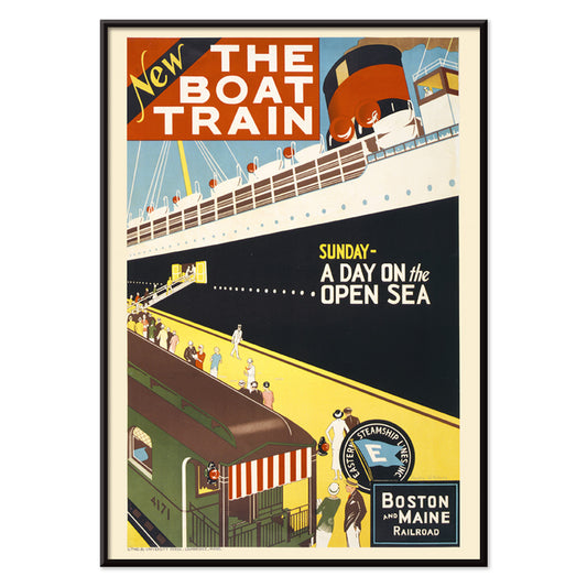
Comboio marítimo Poster
Charles W. Holmes · 1925 · Dinâmico poster Art Deco que conjuga comboio veloz e navio de passageiros
Poster desde €9 · Emoldurado desde €16
Preço normal A partir de €6,00Preço normal -
Barbette Poster
Charles Gesmar · 1926 · Poster de cabaret glamouroso com Barbette entre plumas rosa e toques amarelos
Poster desde €9 · Emoldurado desde €16
Preço normal A partir de €6,00Preço normal -
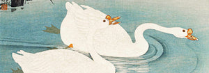
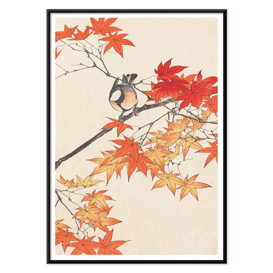
Keinen kachō gafu Poster
Imao Keinen · 1892 · Delicada impressão de ave e folhas de outono em vermelhos quentes e bege suave
Poster desde €9 · Emoldurado desde €16
Preço normal A partir de €6,00Preço normal -
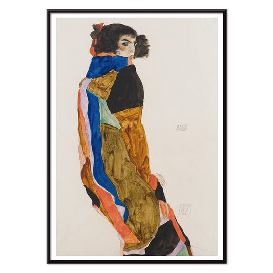
Moa Poster
Egon Schiele · 1911 · Impressão artística intimista de mulher em roupão estampado, serena
Poster desde €9 · Emoldurado desde €16
Preço normal A partir de €6,00Preço normal -
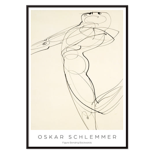
Figura curvada para trás Poster
Oskar Schlemmer · 1931 · Impressão artística Bauhaus de uma figura estilizada curvada em linha preta nítida
Poster desde €9 · Emoldurado desde €16
Preço normal A partir de €6,00Preço normal -
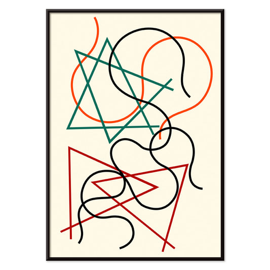
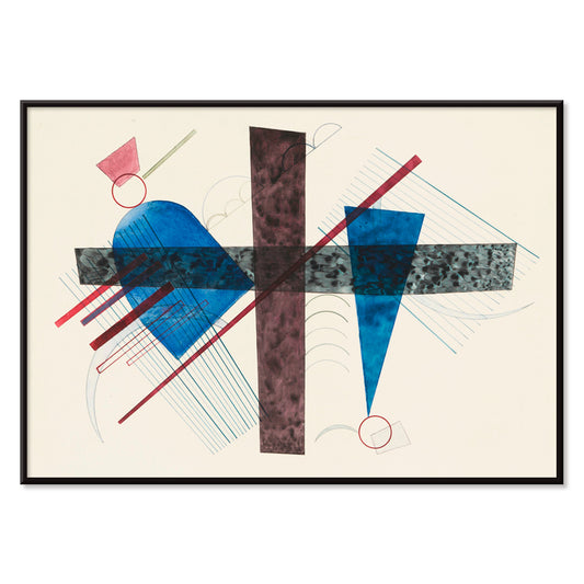
Linhas geométricas e ondulantes Poster
Myriam Thyes · 2014 · Poster geométrico dinâmico com linhas ondulantes e estrutura preta marcante
Poster desde €9 · Emoldurado desde €16
Preço normal A partir de €6,00Preço normal -
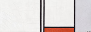
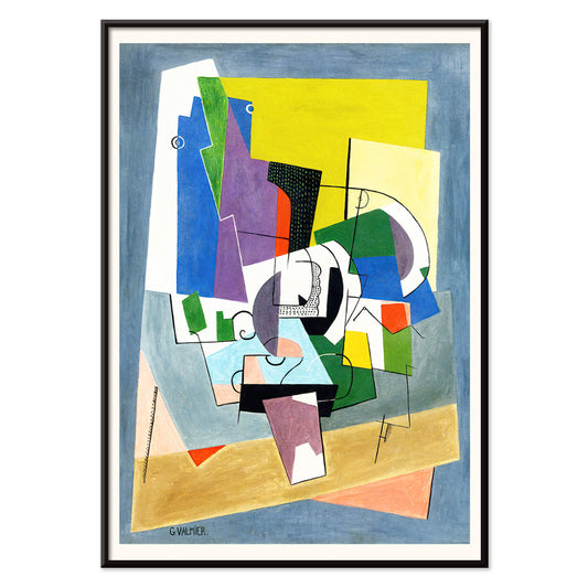
Composition Poster
Georges Valmier · 1921 · Vibrante impressão artística geométrica que equilibra formas curvas e angulares em azul, amarelo e verde
Poster desde €9 · Emoldurado desde €16
Preço normal A partir de €6,00Preço normal -
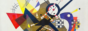
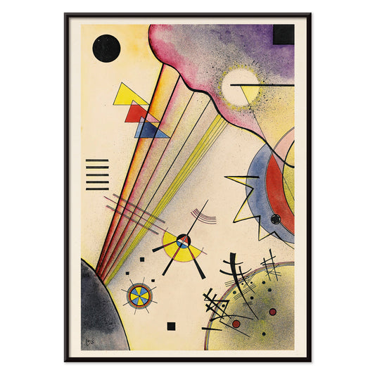
Berührung Poster
Wassily Kandinsky · 1924 · Poster abstrato dinâmico com círculos intersetados, linhas angulares e acentos vermelho e laranja
Poster desde €9 · Emoldurado desde €16
Preço normal A partir de €6,00Preço normal -
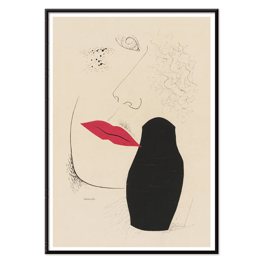
Desejo Poster
Mikuláš Galanda · 1927 · Poster modernista com perfil sombreado e lábios vermelhos vívidos em bege
Poster desde €9 · Emoldurado desde €16
Preço normal A partir de €6,00Preço normal -
Blau in Rund und Spitz Poster
Wassily Kandinsky · 1933 · Impressão artística geométrica abstrata equilibrando círculos azuis, ângulos agudos e toques vermelhos
Poster desde €9 · Emoldurado desde €16
Preço normal A partir de €6,00Preço normal -
Zartes Gemüt Poster
Wassily Kandinsky · 1925 · Impressão artística geométrica com linhas negras nítidas, acentos amarelos e formas roxas
Poster desde €9 · Emoldurado desde €16
Preço normal A partir de €6,00Preço normal -
Kleines Warm Poster
Wassily Kandinsky · 1928 · Poster abstrato caloroso com círculos flutuantes e linhas pretas nítidas em vermelho e amarelo
Poster desde €9 · Emoldurado desde €16
Preço normal A partir de €6,00Preço normal -
Deutliche Verbindung Poster
Wassily Kandinsky · 1925 · Impressão artística geométrica equilibrando círculos e ângulos com acentos primários e violeta
Poster desde €9 · Emoldurado desde €16
Preço normal A partir de €6,00Preço normal -
Ohne Titel Poster
Wassily Kandinsky · 1930 · Impressão artística geométrica abstrata de linhas e círculos flutuantes em bege quente
Poster desde €9 · Emoldurado desde €16
Preço normal A partir de €6,00Preço normal -
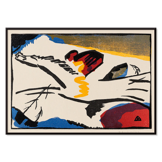
Lyrisches Poster
Wassily Kandinsky · 1911 · Impressão artística lírica com linhas negras enérgicas e acentos vermelhos, azuis e amarelos
Poster desde €9 · Emoldurado desde €16
Preço normal A partir de €6,00Preço normal


36/819 items
- Banhos Salinos de Bex Poster
- Las Vegas – Voe TWA Poster
- Osen Poster
- Zoologischer Garten Poster
- Souvenirs das Minhas Viagens Poster
- Frida Kahlo junto a um agave Poster
- Frida Kahlo sentada junto a um agave Poster
- Marquês de Tavistock Poster
- Frida Kahlo junto a um agave Poster
- Nickerson Paine de biquíni Poster
- Modelo de moda à beira do barco Poster
- Modelo de moda submersa Poster
- Nascente de Weeki Wachee Poster
- Sigmund Freud tinha razão Poster
- Exposição Schiele na Galerie Arnot Poster
- Comboio marítimo Poster
- Barbette Poster
- Moa Poster
- Linhas geométricas e ondulantes Poster
- Composition Poster
- Kleines Warm Poster
- Lyrisches Poster
O preto como estrutura no design de posters vintage
O preto comporta-se muitas vezes menos como uma cor e mais como uma armação. No design de posters vintage, aguça os contornos, estabiliza o ornamento e oferece espaço para respirar às cores. Esta colecção Preto reúne posters onde a escuridão surge como tinta, silhueta, céu nocturno ou espinha tipográfica, um filtro editorial mais do que uma regra monocromática. É um fio prático para arte mural e decoração, especialmente quando se pretende que um espaço pareça composto sem rigidez. Combine estas gravuras com materiais que já trazem uma nota escura, como ferragens em ferro, base de candeeiro mate ou têxtil carvão, e a restante paleta ganha intenção.
Como os artistas usaram o preto para unir a imagem
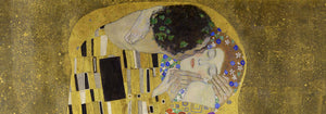
Em The Kiss (1907–1908) de Gustav Klimt, o preto funciona como veludo por trás do ouro, fazendo a superfície parecer iluminada por dentro e ajudando o ornamento a manter legibilidade. Em Tournée du Chat Noir (1896) de Théophile Alexandre Steinlen, um campo de meia-noite plano transforma-se em teatro, provando como a silhueta pode transportar carácter e humor com quase nenhuma modelação. O equilíbrio modernista aparece em Circles in a Circle (1923) de Wassily Kandinsky, onde linhas pretas actuam como andaime para cor e movimento. Mesmo a ousadia publicitária depende da escuridão: Vermouth Martini (1920) de Leonetto Cappiello usa sombra profunda para fazer o amarelo cítrico e os tons de pele sobressaírem, um truque clássico de poster para leitura imediata.
Colocar arte de parede com acentos pretos na decoração
Porque o preto lê-se como estrutura, estas escolhas de poster são adequadas a espaços que beneficiam de ordem visual: entradas, cozinhas e cantos de trabalho. Contra paredes pálidas, gravuras com acentos pretos ficam nítidas e arquitectónicas; contra tinta saturada, criam tensão e profundidade. Em quartos, um contorno escuro ou moldura pode acalmar uma paleta ocupada, enquanto em salas de jantar funciona como um fato feito à medida, oferecendo à luz das velas e à cerâmica um palco mais claro. Para companheiros de alto contraste, veja Preto e Branco; para composições contidas, Minimalista mantém o ritmo limpo. Se prefere gráficos de época e energia de sinalética, Publicidade acrescenta tipografia audaz e jogo figura-fundo dramático.
Criar conjugações, temas e molduras
Numa parede de galeria mista, deixe o preto ser a nota repetida: um poster gráfico, uma placa figurativa, uma impressão abstracta. Uma prancha de vida selvagem como Tiger's Head (1911) de Abbott Handerson Thayer traz pinceladas densas e pêlo em sombra que se integra naturalmente com latão, couro e madeira escura. Para espaços medidos e disciplina tipográfica, acrescente geometria de Bauhaus; para temas naturais, Animais mantém a coerência imagética enquanto permite que o traço preto reapareça. Se desejar um registo mais simbólico, Esotérico introduz molduras tipo tarot, estrelas e diagramas que ecoam a cultura das linhas científicas. A moldura conta: freixo preto ou nogueira fina podem espelhar a tinta sem tornar a divisão pesada, enquanto uma margem branca generosa adiciona ar em torno de contornos intrincados e tipos pequenos.
Um acento escuro que permanece flexível
Os detalhes pretos são frequentemente o que perdura na memória: o contorno de um gato, uma grelha modernista, a fina borda de uma etiqueta. Trate esta colecção como uma ferramenta de decoração, escolhendo uma impressão vintage para ancorar uma divisão e deixando a cor, a textura e a luz mudarem à volta dela ao longo do tempo. Quando o preto é usado como nota de acabamento e não como proclamação, os posters parecem menos nostalgia de época e mais design de olhar claro.