


- Destroy This Mad Brute Poster
- O bom vizinho da América do Sul Poster
- Itália e Cidade do Vaticano Poster
- Les Lalanne Poster
- Casal a dançar na neve Poster
- Jet Clipper para o Hawaii Poster
- Kohler Chocolat Poster
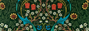
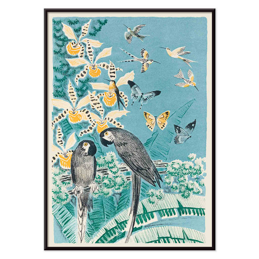
- Strawberry Thief Poster
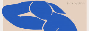
- Matisse Figuras Dançantes Poster
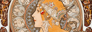
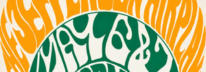
- Tom Krojer Exposição Poster
- Cena de Rua de Berlim Poster
- Exposição de Ernst Kirchner Poster
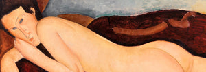
- Mulher Sentada de Costas Poster
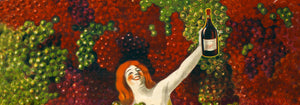
- Cabelo vermelho e chapéu azul Poster
- Parque perto de Lu Poster
- El Comienzo Poster
- Parler Seul 2 Poster
- Anel do Crepúsculo Poster
- Parler Seul Poster
- The Dream Poster
- Le Concert Poster
- Artista Feminina Poster
- Revenge of the Pink Panther Poster
- Mulher e Pássaro à Noite Poster
- Visite Porto Rico Poster
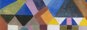
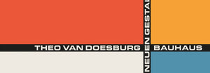
- Bauhaus 20 Poster
- Bauhaus 21 Poster
- Coma mais frutas Poster
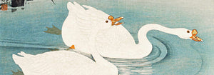
- Grou japonês azul Poster
- Snoopy Come Home Poster
- Para Londres por Jet Clipper Poster
- Crans-sur-Sierre Poster
- Monte Carlo Poster
- Pacific Vibrations Poster
- Continental Hawaii Companhia Aérea Poster
- Cerveja e Cigarro Poster
- Costa Oeste do México Poster
-
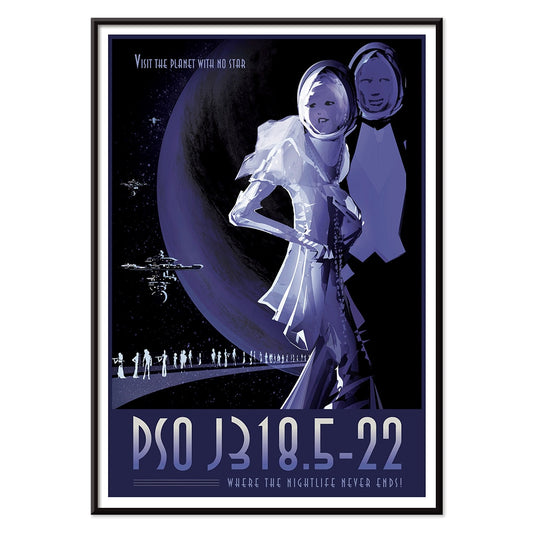
PSO J318.5-22 Poster
Tiffany J. Davis · 2013 · Poster retro-futurista que imagina um planeta errante em noite cósmica eterna
Poster desde €9 · Emoldurado desde €16
Preço normal A partir de €6,00Preço normal -
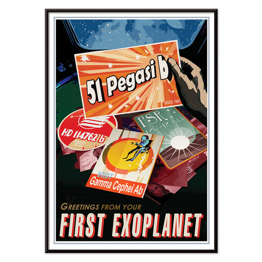
Exoplaneta Poster
Joby Harris · 2019 · Poster retro de exoplaneta com formas planetárias marcantes e layout em estilo postal
Poster desde €9 · Emoldurado desde €16
Preço normal A partir de €6,00Preço normal -
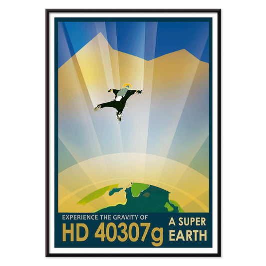
HD 40307g Poster
R. Hurt · 2013 · Poster de paraquedista sobre paisagem exoplaneta em tons cobalto e nuvens luminosas
Poster desde €9 · Emoldurado desde €16
Preço normal A partir de €6,00Preço normal -
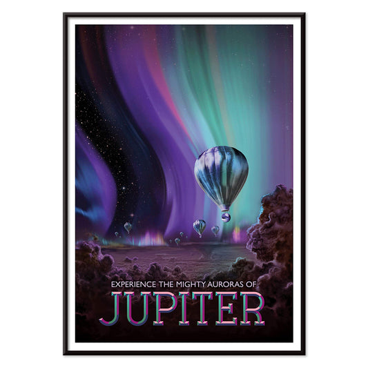
Júpiter Poster
Tyler Nordgren · 2016 · Surreal poster de Júpiter com auroras polares luminosas e minúsculos balões de ar quente
Poster desde €9 · Emoldurado desde €16
Preço normal A partir de €6,00Preço normal -
Marte Poster
K8 Spencer · 1976 · Poster retro de turismo em Marte com sítios de aterragem da NASA
Poster desde €9 · Emoldurado desde €16
Preço normal A partir de €6,00Preço normal -
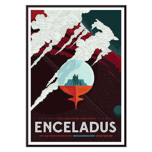
Enceladus Poster
Joby Harris · 2008 · Poster retro-futurista de Enceladus com géiseres dramáticos e paisagem glacial arrojada
Poster desde €9 · Emoldurado desde €16
Preço normal A partir de €6,00Preço normal -
Europa Poster
Terry Fan · 2018 · Poster onírico de Europa com exploradores sob um teto de gelo em azul profundo
Poster desde €9 · Emoldurado desde €16
Preço normal A partir de €6,00Preço normal -
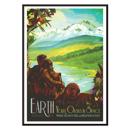
Terra Poster
Robert McCall · 2018 · Poster retro de exploração espacial com astronautas contemplando uma paisagem luxuriante azul-esverdeada
Poster desde €9 · Emoldurado desde €16
Preço normal A partir de €6,00Preço normal -
Ceres Poster
Daniel Zeller · 1979 · Poster inspirado na NASA com dois exploradores a recolher água sob céu estrelado
Poster desde €9 · Emoldurado desde €16
Preço normal A partir de €6,00Preço normal -
Gamma Ray Ghouls Poster
Don Davis · 2019 · Poster retro de ficção científica com astronautas a flutuar numa explosão cósmica neon
Poster desde €9 · Emoldurado desde €16
Preço normal A partir de €6,00Preço normal -
Rains of Terror Poster
Eleni Katsenidou · 1995 · Vibrante poster de ficção científica com planeta iminente e chuva meteórica inclinada
Poster desde €9 · Emoldurado desde €16
Preço normal A partir de €6,00Preço normal -
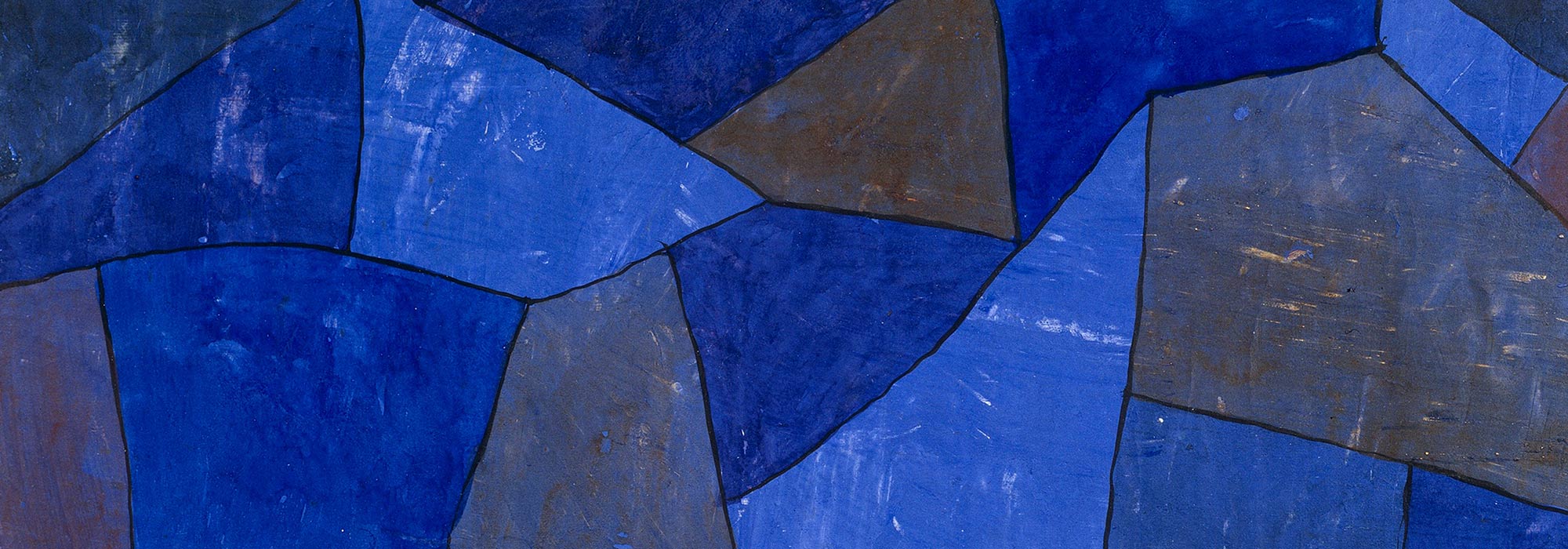
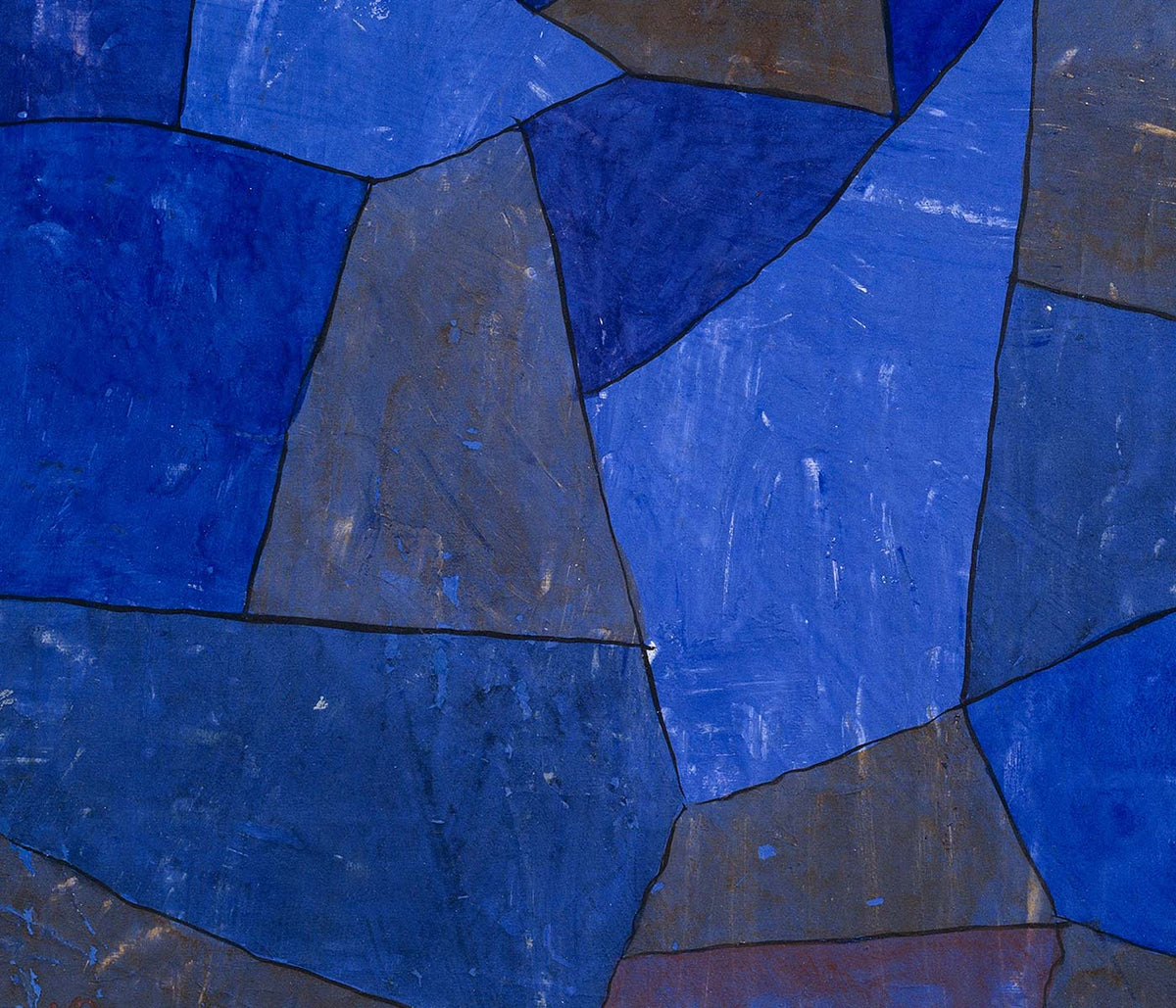
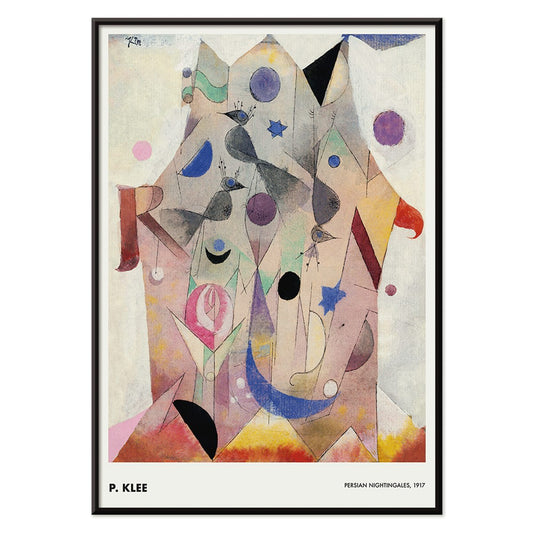
Rouxinóis persas Poster
Paul Klee · 1917 · Formas de aves oníricas e tonalidades joia numa impressão artística abstrata
Poster desde €9 · Emoldurado desde €16
Preço normal A partir de €6,00Preço normal -
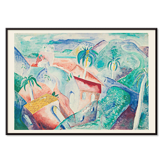
Paisagem Cubana Poster
Paul Gaulois · 1926 · Poster de paisagem cubana iluminado pelo sol em verdes exuberantes, céu cobalto e tons quentes de aldeia
Poster desde €9 · Emoldurado desde €16
Preço normal A partir de €6,00Preço normal -
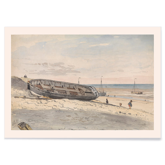
Barcaças na praia Poster
Willem Anthonie van Deventer · 1870 · Serena impressão artística costeira com barcaças encalhadas em tons bege cinzento e azul suave
Poster desde €9 · Emoldurado desde €16
Preço normal A partir de €6,00Preço normal -
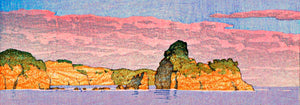
Barcos ao pôr-do-sol Poster
Ohara Matao · 1927 · Sereno poster de barcos com sol vermelho sobre água azul ao pôr-do-sol
Poster desde €9 · Emoldurado desde €16
Preço normal A partir de €6,00Preço normal -
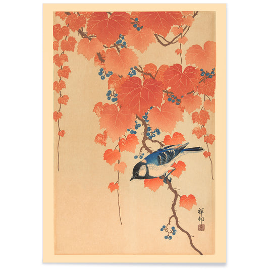
Ramo de Paulownia Poster
Ohara Koson · 1910 · Elegante impressão de pássaro azul pousado num ramo de Paulownia com folhas e bagas
Poster desde €9 · Emoldurado desde €16
Preço normal A partir de €6,00Preço normal -
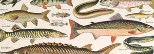
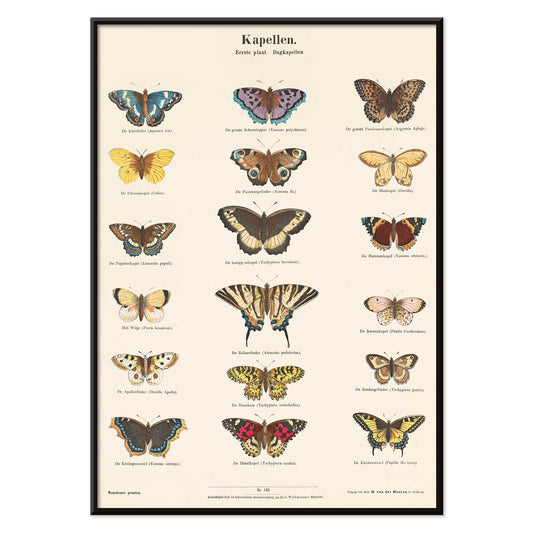
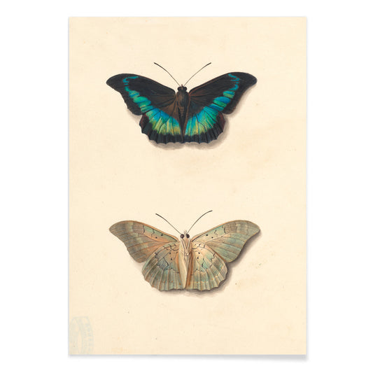
Borboletas Poster
Ernst Fröhlich · 1840 · Impressão detalhada de borboletas com dezoito espécies e legendas em neerlandês e latim
Poster desde €9 · Emoldurado desde €16
Preço normal A partir de €6,00Preço normal -
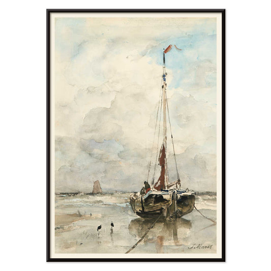
Veleiro na praia Poster
Jacob Hendricus Maris · 1876 · Serena impressão artística de veleiro solitário sob amplo céu e luz costeira suave
Poster desde €9 · Emoldurado desde €16
Preço normal A partir de €6,00Preço normal -
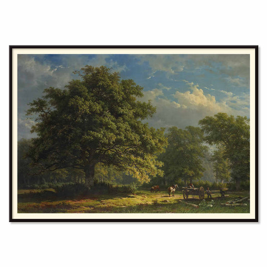
Floresta de Bentheim Poster
George Andries Roth · 1837 · Tranquila impressão artística de floresta com viajantes e cavalos sob árvores imponentes
Poster desde €9 · Emoldurado desde €16
Preço normal A partir de €6,00Preço normal -
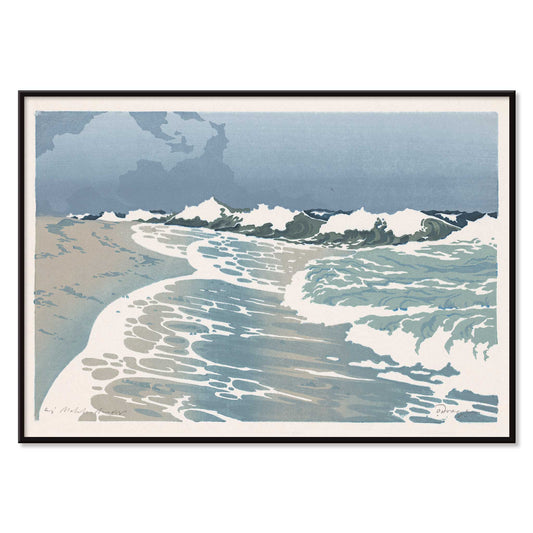
Beira-mar Poster
Orest Droegly · 1970 · Sereno poster de ondas em bandas azuis sobrepostas com espuma branca arejada
Poster desde €9 · Emoldurado desde €16
Preço normal A partir de €6,00Preço normal -
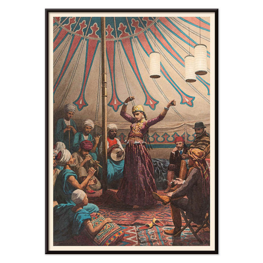
Dançarina egípcia Poster
Willem de Famars Testas · 1870 · Intimista impressão artística oriental de dançarina egípcia com músicos e espectadores
Poster desde €9 · Emoldurado desde €16
Preço normal A partir de €6,00Preço normal -
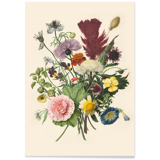
Buquê de Flores Poster
Herman Henstenburgh · 1700 · Rica impressão artística floral com camadas de flores, folhas curvadas e reflexos joia
Poster desde €9 · Emoldurado desde €16
Preço normal A partir de €6,00Preço normal -
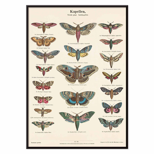
Borboletas Noturnas Poster
Ernst Fröhlich · 1878 · Impressão detalhada de borboletas noturnas com espécies identificadas em placa de estudo naturalista
Poster desde €9 · Emoldurado desde €16
Preço normal A partir de €6,00Preço normal -
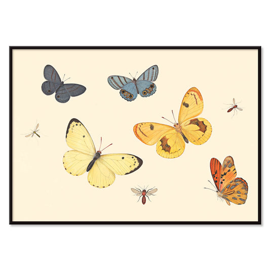
Cinco Borboletas Poster
Pieter Withoos · 1675 · Delicada impressão de insetos com cinco borboletas, uma vespa e duas moscas
Poster desde €9 · Emoldurado desde €16
Preço normal A partir de €6,00Preço normal -
Kagekiyo Poster
Torii Kiyotada VII · 1893 · Poster kabuki dramático com retrato feroz do ator e linhas teatrais marcantes
Poster desde €9 · Emoldurado desde €16
Preço normal A partir de €6,00Preço normal -
Douze contes de Paris et de Provence Poster
Paul Arène · 1879 · Poster encantador com aves e borboletas em moldura de folhagem luxuriante
Poster desde €9 · Emoldurado desde €16
Preço normal A partir de €6,00Preço normal -
Loïe Fuller Poster
Jean de Paléologue · 1897 · poster serpentina eléctrico com véus amarelos a rodopiar sobre fundo preto dramático
Poster desde €9 · Emoldurado desde €16
Preço normal A partir de €6,00Preço normal -
Círculo cromático Poster
Michel Eugène Chevreul · 1861 · Impressão científica clássica de um círculo cromático que mapeia relações harmónicas de matizes
Poster desde €9 · Emoldurado desde €16
Preço normal A partir de €6,00Preço normal -
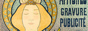
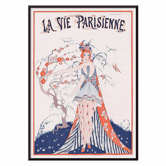
La Vie Parisienne Poster
Umberto Brunelleschi · 1913 · Capa de revista parisiense elegante em poster com vestido floral e silhueta refinada
Poster desde €9 · Emoldurado desde €16
Preço normal A partir de €6,00Preço normal -
Lava Life Poster
Sophia Kolinas · 2022 · Poster retro-futurista que mostra uma cápsula de observação sobre um mar de lava
Poster desde €9 · Emoldurado desde €16
Preço normal A partir de €6,00Preço normal -
TRAPPIST-1e Poster
Robert Hurt · 2017 · Poster espacial futurista com vista de exoplaneta em céu vermelho emoldurada por uma janela de espaçonave
Poster desde €9 · Emoldurado desde €16
Preço normal A partir de €6,00Preço normal -
Trovoada Súbita Poster
Utagawa Sadahide · 1862 · Poster dramático de chuva com figuras agachadas sob um pano padronizado e relâmpagos
Poster desde €9 · Emoldurado desde €16
Preço normal A partir de €6,00Preço normal -
Cena de rua no Norte de África Poster
Edwin Lord Weeks · 1927 · Poster de rua do Norte de África banhado por luz solar, tons terra quentes e sombras azuladas
Poster desde €9 · Emoldurado desde €16
Preço normal A partir de €6,00Preço normal -
Flores, Fruta e Pássaros Poster
Jan van Os · 1777 · Opulenta impressão artística de natureza morta com flores de jardim, fruta madura e pequenos pássaros
Poster desde €9 · Emoldurado desde €16
Preço normal A partir de €6,00Preço normal -
Duas borboletas Poster
Georgius Jacobus Johannes van Os · 1826 · Delicada impressão com detalhe naturalista sobre fundo bege arejado
Poster desde €9 · Emoldurado desde €16
Preço normal A partir de €6,00Preço normal -
Flores de nandina Poster
Ohara Koson · 1910 · Elegante impressão de aves com dois papa-moscas azuis entre bagas de nandina cobertas de neve
Poster desde €9 · Emoldurado desde €16
Preço normal A partir de €6,00Preço normal


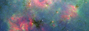
Azul como atmosfera, não apenas uma cor
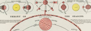
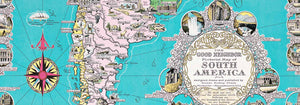
O azul raramente se comporta como uma cor única. No design de pósters vintage transforma-se em distância, tempo, clima e profundidade, variando de tinta prussiana a lavados de céu conforme o motivo muda. Esta colecção vê o azul como elemento estrutural na decoração mural: pode arrefecer uma divisão, clarificar um traço e conferir ao papel uma sensação de arquivo. Encontra-se em imagens costeiras, em placas diagramáticas e em composições gráficas onde o campo azul assume o papel principal em vez de ser mero fundo. Para humores próximos, a contenção minimalista dos pósters Minimalista e o foco tonal das impressões Preto e Branco oferecem contrapontos limpos.
Índigo, cianótipo e o céu modernista
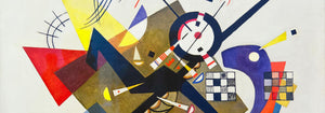
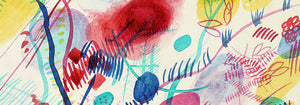
Historicamente, o azul surge tanto por tecnologias diferentes como por gosto. O índigo têxtil transitou entre o artesanato e a indústria, enquanto o cianótipo gerou imagens fotográficas a partir da química e da luz solar, produzindo aquele azul de planta que é logo reconhecível. Strawberry Thief (1883) de William Morris coloca um índigo rico atrás de frutas e aves, transformando a repetição numa espécie de arquitectura doméstica que funciona ao mesmo tempo como padrão e cena pictórica. O Fern (1850) cianótipo de Anna Atkins mostra como a mesma cor pode servir de prova: a planta surge como uma silhueta precisa, a meio caminho entre espécime e renda. Na abstração moderna, Bleu de Ciel (1925) de Wassily Kandinsky usa o azul como palco para signos flutuantes, ligando a pintura à fascinação da época pela música, pela ciência e pela cartografia do invisível. Mundos afins de forma e cor residem em Abstrato e Bauhaus.
Colocar arte mural azul na paleta de casa
Na decoração, o azul é mais fácil de conviver quando se ancora em materiais. Madeiras quentes e neutros arenosos impedem que os azuis profundos pareçam frios, enquanto aço escovado e vidro tornam os azuis pálidos deliberados em vez de meramente decorativos. Numa entrada, uma impressão azul funciona como uma bússola visual; num quarto lê-se mais calma se ecoada no linho ou numa carpete. Nas cozinhas, o azul junto a azulejos brancos tende a ficar nítido, sobretudo quando a imagem é botânica ou cartográfica. Se procura motivos reconhecíveis com ênfase no azul, veja Mapas, Mar e Oceano e Botânica; se a divisão já tem cor forte, uma peça mais simples de Arte Clássica ajuda a manter o equilíbrio.
Curadoria: ritmo, escala e escolhas de moldura
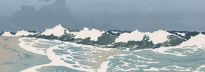
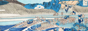
O azul facilita a curadoria porque unifica imagens mistas numa parede galeria. Comece com uma peça dominante e acrescente um ou dois companheiros mais discretos que repitam a sua temperatura sem copiar o motivo. The Great Wave off Kanagawa (1830) de Hokusai é um âncora óbvio: o azul da onda não é atmosférico mas arquitectónico, construído por contornos esculpidos e espuma, quase como tipografia. Combine com Morning at Cape Inubō (1931) de Kawase Hasui, onde o mar reduz-se a bandas e gradientes, criando uma cadência mais calma. Para evitar que a composição fique excessivamente náutica, insira uma placa cartográfica ou uma composição abstrata como pausa visual. Os acabamentos de moldura também orientam o tom: carvalho claro mantém os azuis arejados, uma passe-partout branca dá ar às tintas escuras e uma moldura preta fina aumenta o contraste; opções disponíveis em Molduras.
Azul como tinta, corante, pigmento e dado
O que une estes pósters não é uma época única nem um tema específico, mas a maneira como o azul transporta informação. Pode ler-se como corante artesanal, tinta de impressão, pigmento mineral ou notação científica, pelo que se integra bem em divisões que misturam cerâmica, livros e objectos de viagem sem parecer encenado. Como arte mural vintage, o azul costuma sugerir tanto o mar como a biblioteca: uma cor associada a horizontes e ao estudo. Essa tensão entre sensação e estrutura é o verdadeiro fio da colecção e aquilo que faz com que o azul se mantenha firme na decoração do dia a dia.