


- Destroy This Mad Brute Poster
- Shaw ou Ironia Poster
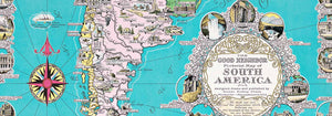
- O bom vizinho da América do Sul Poster
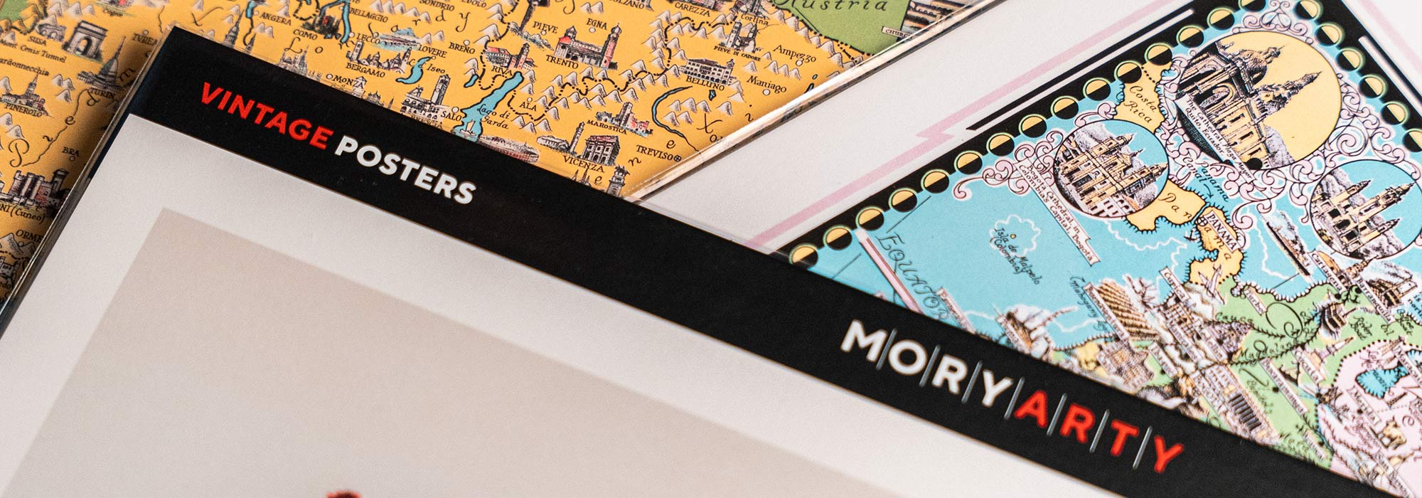
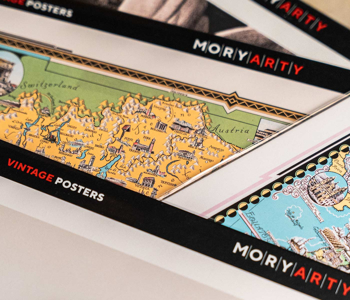
- Itália e Cidade do Vaticano Poster
- Cebolas Poster
- Rabanetes Poster
- Cenouras Poster
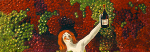
- Les Lalanne Poster
- Punch Boutique Poster
- Casal a dançar na neve Poster
- Ponto de vista sobre o judaísmo e o paganismo Poster
- Jet Clipper para o Hawaii Poster
- Campari Soda Poster
- Bec-Kina Poster
- Kohler Chocolat Poster
- Strawberry Thief Poster
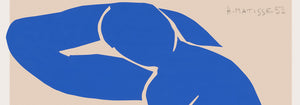
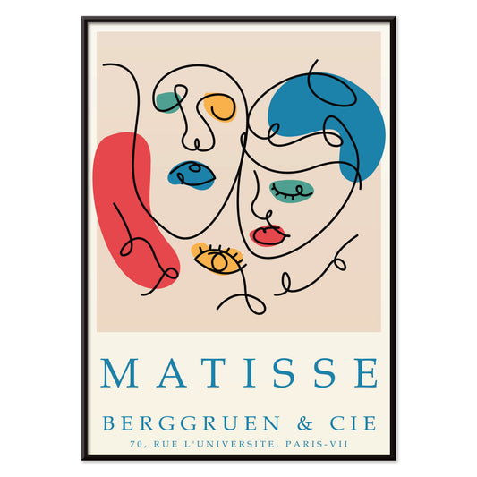
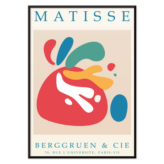
- Matisse Figuras Dançantes Poster
- Tom Krojer Exposição Poster
- Cena de Rua de Berlim Poster
- Exposição de Ernst Kirchner Poster
- Tour Eiffel 2 Poster
- Mulher Sentada de Costas Poster
- Cabelo vermelho e chapéu azul Poster
- Parque perto de Lu Poster
- El Comienzo Poster
- Parler Seul 2 Poster
- Posição Atual dos Mahatmas Poster
- Anel do Crepúsculo Poster
- Parler Seul Poster
- Faun and Nymphe Poster
- The Dream Poster
- Le Concert Poster
- Pássaro atravessando uma nuvem Poster
-
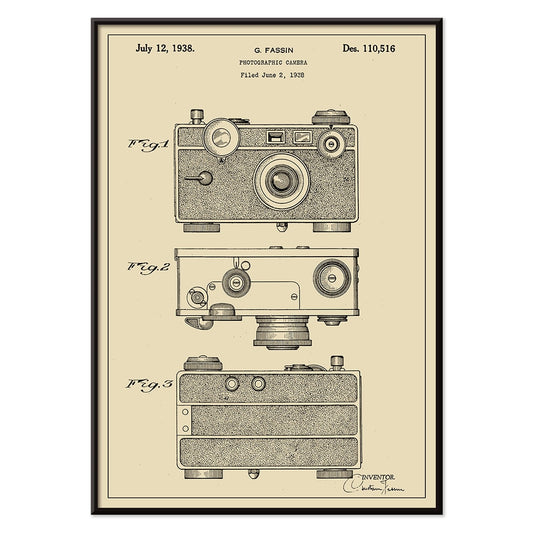
Patente de câmara fotográfica Poster
G. Fassin · 1938 · Impressão de patente de câmara precisa com diagramas numerados e traço preto nítido
Poster desde €9 · Emoldurado desde €16
Preço normal A partir de €6,00Preço normal -
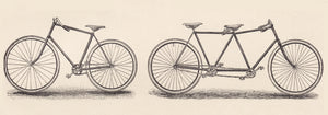
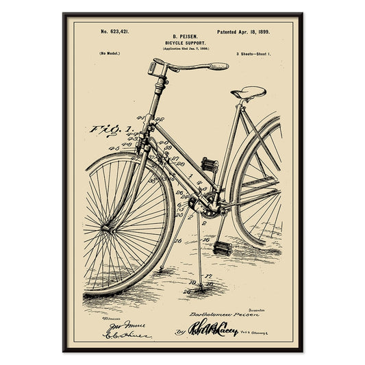
Patente de suporte para bicicleta Poster
B. Peisen · 1899 · Impressão vintage detalhada do suporte de bicicleta com diagramas de patente nítidos e anotações
Poster desde €9 · Emoldurado desde €16
Preço normal A partir de €6,00Preço normal -
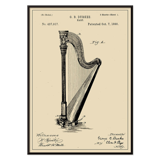
Patente de harpa Poster
G.B. Durkee · 1890 · Imagem de patente de harpa com diagramas precisos e tipografia de arquivo elegante
Poster desde €9 · Emoldurado desde €16
Preço normal A partir de €6,00Preço normal -
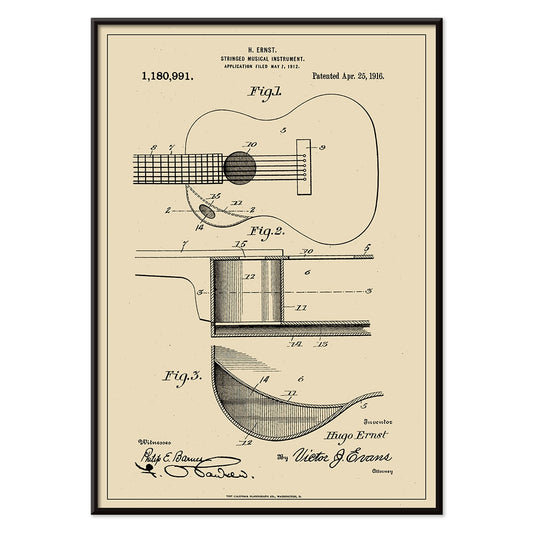
Patente de instrumento musical Poster
H. Ernst · 1916 · Intrincada impressão de patente de guitarra com diagramas precisos e indicações numeradas em fundo bege quente
Poster desde €9 · Emoldurado desde €16
Preço normal A partir de €6,00Preço normal -
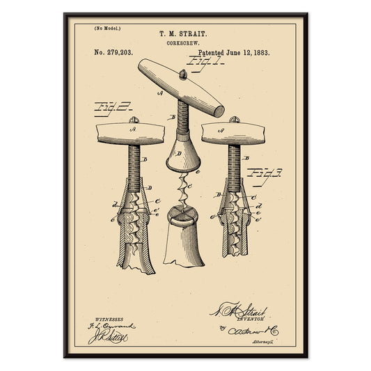
Patente de saca-rolhas Poster
T.M. Strait · 1883 · Impressão vintage patente de saca-rolhas com várias vistas técnicas e anotações
Poster desde €9 · Emoldurado desde €16
Preço normal A partir de €6,00Preço normal -
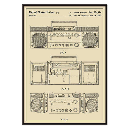
Patente de leitor de cassete Poster
Sujanani · 1985 · Poster de patente de leitor de cassete com linhas pretas precisas sobre fundo bege quente
Poster desde €9 · Emoldurado desde €16
Preço normal A partir de €6,00Preço normal -
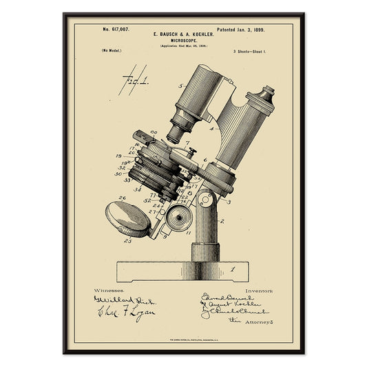
Patente de microscópio Poster
E. Bausch · 1899 · Impressão técnica de patente de microscópio com linhas rotuladas nítidas em papel bege quente
Poster desde €9 · Emoldurado desde €16
Preço normal A partir de €6,00Preço normal -
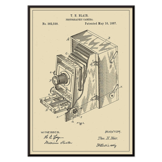
Patente de câmara fotográfica Poster
T.H. Blair · 1887 · Impressão vintage de patente de câmara com diagramas nítidos e componentes numerados
Poster desde €9 · Emoldurado desde €16
Preço normal A partir de €6,00Preço normal -
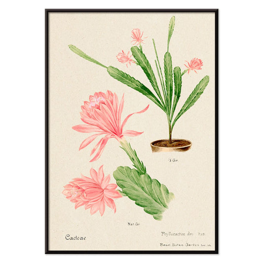
Cacto Imperatriz Alemã Poster
Artista desconhecido · 1899 · Delicada impressão de cacto em flor rosa com detalhe botânico nítido sobre fundo bege quente
Poster desde €9 · Emoldurado desde €16
Preço normal A partir de €6,00Preço normal -
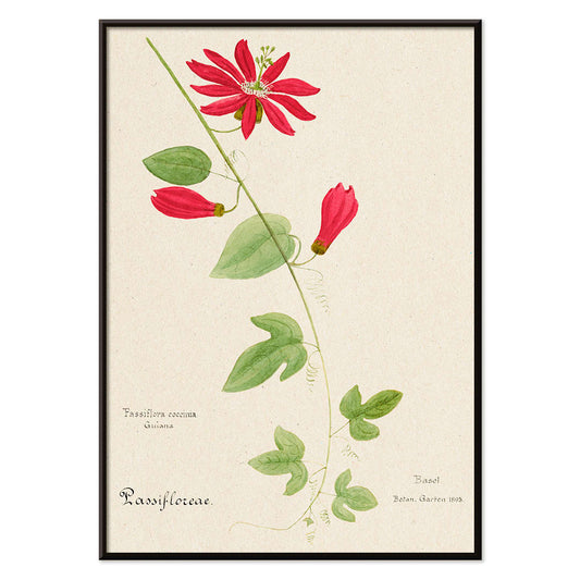
Granadilla Vermelha Poster
Artista desconhecido · 1899 · Marcante impressão botânica com flores escarlates, folhas verdes e fundo bege
Poster desde €9 · Emoldurado desde €16
Preço normal A partir de €6,00Preço normal -
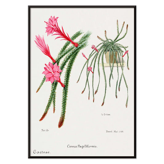
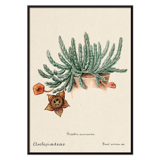
Cacto-rabo-de-rato Poster
Artista desconhecido · 1899 · Elegante poster de cacto-rabo-de-rato com caules verdes pendentes e flores rosa e vermelhas
Poster desde €9 · Emoldurado desde €16
Preço normal A partir de €6,00Preço normal -
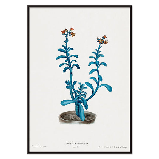
Echeveria Açúcar Castanho Poster
Artista desconhecido · 1899 · Impressão botânica detalhada de Echeveria racemosa com folhas azul esverdeadas e pontas vermelhas
Poster desde €9 · Emoldurado desde €16
Preço normal A partir de €6,00Preço normal -
Cacto colmeia Poster
Artista desconhecido · 1899 · Impressão botânica detalhada do cacto colmeia em suaves tons verdes com delicadas flores vermelhas
Poster desde €9 · Emoldurado desde €16
Preço normal A partir de €6,00Preço normal -
Cacto arco-íris e lírio-da-páscoa Poster
Artista desconhecido · 1899 · Impressão botânica detalhada de cacto e lírio em tons suaves
Poster desde €9 · Emoldurado desde €16
Preço normal A partir de €6,00Preço normal -
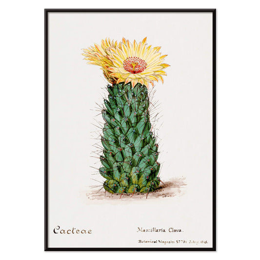
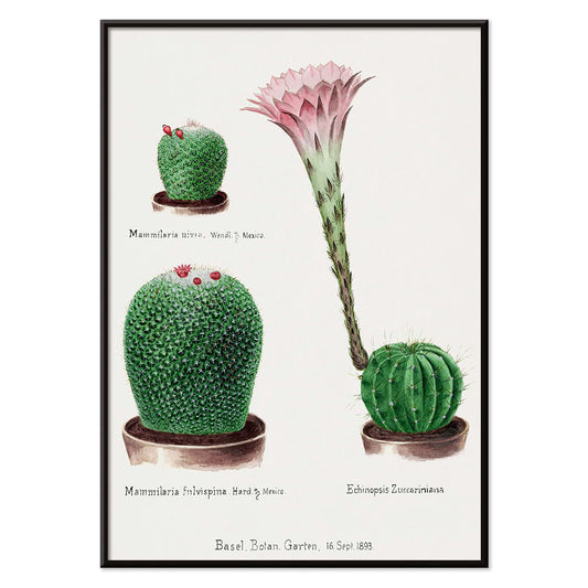
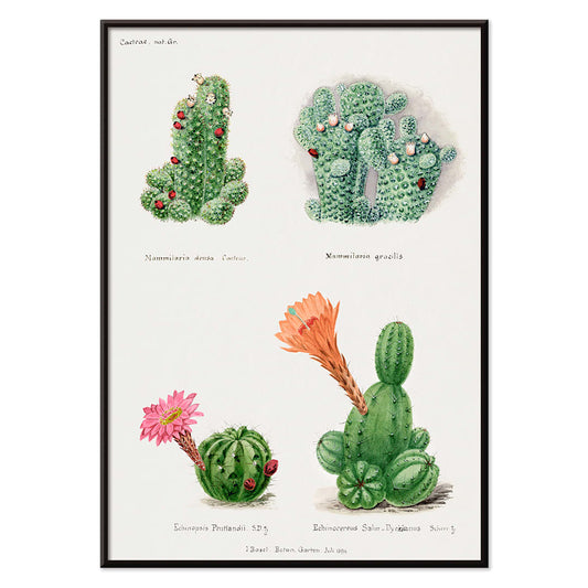
Cactos sortidos Poster
Artista desconhecido · 1899 · Viva impressão botânica de cactos com formas variadas e flores vibrantes
Poster desde €9 · Emoldurado desde €16
Preço normal A partir de €6,00Preço normal -
Cacto-estrela Poster
Artista desconhecido · 1899 · Impressão botânica detalhada de cacto-estrela com flor pontilhada e aspecto dramático em papel bege
Poster desde €9 · Emoldurado desde €16
Preço normal A partir de €6,00Preço normal -
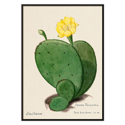
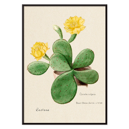
Figo-da-Índia Opuntia Poster
Artista desconhecido · 1899 · Impressão botânica detalhada de opuntia com almofadas verdes segmentadas e flor amarela suave
Poster desde €9 · Emoldurado desde €16
Preço normal A partir de €6,00Preço normal -
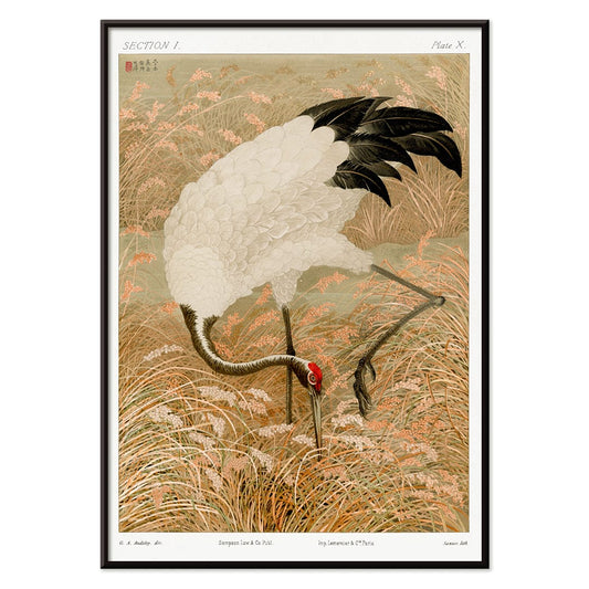
Guindaste sarus em campos de arroz Poster
Artista desconhecido · 1884 · Graciosa impressão vintage de guindaste Sarus entre colmos de arroz em tons bege quente
Poster desde €9 · Emoldurado desde €16
Preço normal A partir de €6,00Preço normal -
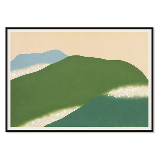
Yoshino Poster
Kamisaka Sekka · 1909 · Sereno poster japonês com colinas verdes e azuis abstratas em bege quente
Poster desde €9 · Emoldurado desde €16
Preço normal A partir de €6,00Preço normal -
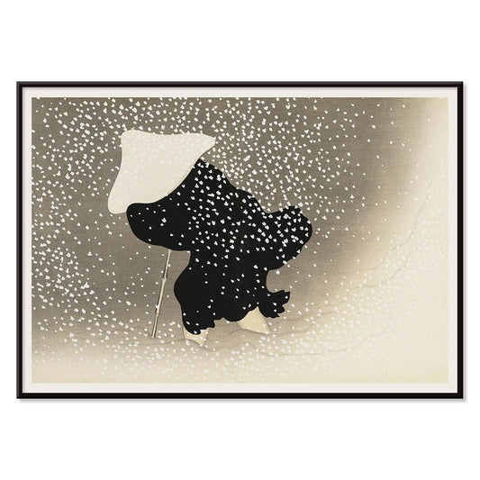
Ryoson Poster
Kamisaka Sekka · 1909 · Serena impressão artística de paisagem marinha com ondas estilizadas e silhueta costeira discreta
Poster desde €9 · Emoldurado desde €16
Preço normal A partir de €6,00Preço normal -
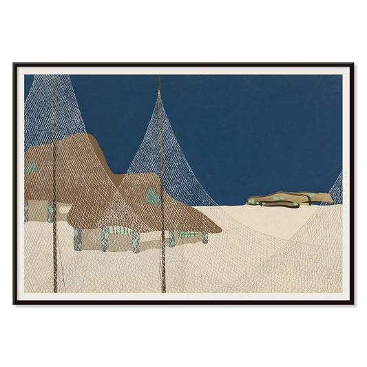
Tomoe no yuki Poster
Kamisaka Sekka · 1909 · Serena impressão artística de neve com curvas pretas e amplo espaço bege
Poster desde €9 · Emoldurado desde €16
Preço normal A partir de €6,00Preço normal -
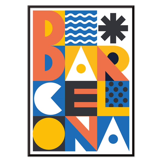
Barcelona Texto Poster
MORYARTY · 2021 · Poster Barcelona moderno com tipografia empilhada em negrito e blocos geométricos coloridos
Poster desde €9 · Emoldurado desde €16
Preço normal A partir de €6,00Preço normal -
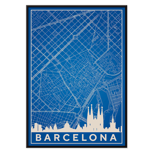
Mapa de Barcelona 2 Poster
MORYARTY · 2019 · Poster minimalista azul e branco de Barcelona com silhueta do skyline e traçado preciso de ruas
Poster desde €9 · Emoldurado desde €16
Preço normal A partir de €6,00Preço normal -
Coleção de folhas Poster
Shirley Hibberd · 1855 · Delicada impressão botânica com formas de folhas variadas e nervuras finas
Poster desde €9 · Emoldurado desde €16
Preço normal A partir de €6,00Preço normal -
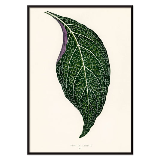
Adelaster Albivenis Poster
Shirley Hibberd · 1855 · Elegante impressão botânica de uma folha verde com veias roxas sobre branco
Poster desde €9 · Emoldurado desde €16
Preço normal A partir de €6,00Preço normal -
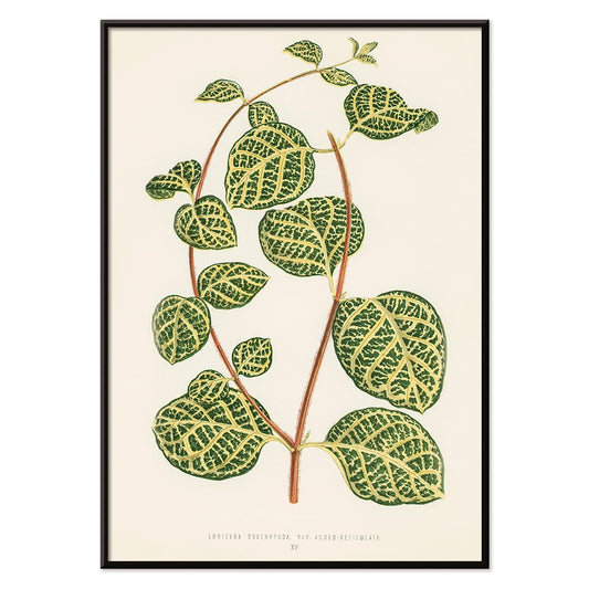
Lonicera Brachypoda Poster
Shirley Hibberd · 1855 · Elegante impressão artística de madressilva com folhagem e flores em papel bege quente
Poster desde €9 · Emoldurado desde €16
Preço normal A partir de €6,00Preço normal -
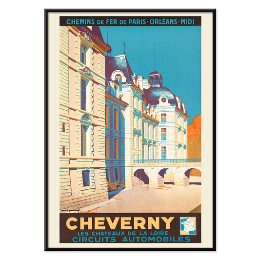
Cheverny Poster
René Roussel · 1952 · Elegante poster de viagem do château equilibrando arquitetura bege com céu azul vivo e toques quentes
Poster desde €9 · Emoldurado desde €16
Preço normal A partir de €6,00Preço normal -
Mapa minimalista de Barcelona Poster
MORYARTY · 2018 · Poster minimalista de Barcelona com linhas vermelhas marcantes sobre fundo bege quente
Poster desde €9 · Emoldurado desde €16
Preço normal A partir de €6,00Preço normal -
Figueira-da-índia Poster
Artista desconhecido · 1899 · Impressão botânica detalhada de figueira-da-índia com flores amarelas e almofadas verdes
Poster desde €9 · Emoldurado desde €16
Preço normal A partir de €6,00Preço normal -
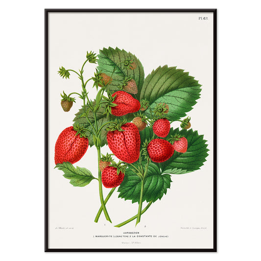
Cromolitografia de morango Poster
Abraham Jacobus Wendel · 1879 · Impressão vívida de morangos com detalhe botânico nítido e frutos maduros
Poster desde €9 · Emoldurado desde €16
Preço normal A partir de €6,00Preço normal -
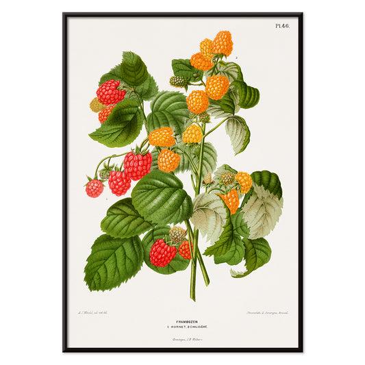
Cromolitografia de framboesa Poster
Abraham Jacobus Wendel · 1879 · Impressão botânica detalhada de framboesa com bagas maduras vermelhas e folhas serradas
Poster desde €9 · Emoldurado desde €16
Preço normal A partir de €6,00Preço normal -
Papiers découpés 5 Poster
MORYARTY · 2023 · Faces abstratas coloridas em poster construído com formas recortadas nítidas
Poster desde €9 · Emoldurado desde €16
Preço normal A partir de €6,00Preço normal -
Papiers découpés 4 Poster
MORYARTY · 1952 · Poster abstrato em estilo recorte alegre com formas vermelhas e azuis fortes sobre fundo bege
Poster desde €9 · Emoldurado desde €16
Preço normal A partir de €6,00Preço normal -
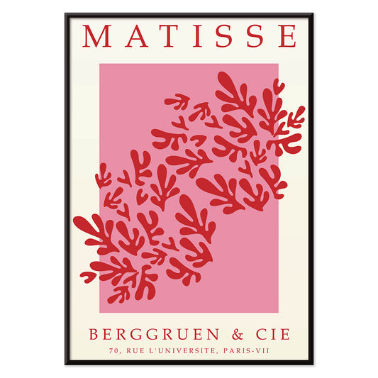
Papiers découpés 3 Poster
MORYARTY · 1949 · Poster inspirado em Matisse com formas de folha vermelhas sobre branco e rosa arejado
Poster desde €9 · Emoldurado desde €16
Preço normal A partir de €6,00Preço normal -
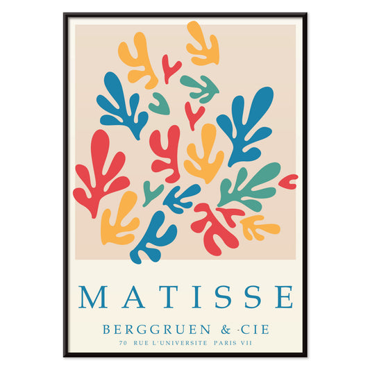
Papiers découpés 2 Poster
MORYARTY · 2023 · Poster abstrato inspirado em Matisse com formas recortadas e cores primárias vibrantes
Poster desde €9 · Emoldurado desde €16
Preço normal A partir de €6,00Preço normal -
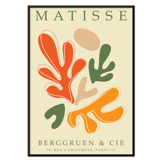
Papiers découpés 1 Poster
MORYARTY · 2021 · Vibrante poster abstrato em recorte de papel com formas laranja e verde sobre fundo bege
Poster desde €9 · Emoldurado desde €16
Preço normal A partir de €6,00Preço normal


36/1749 items
- Patente de câmara fotográfica Poster
- Patente de suporte para bicicleta Poster
- Patente de instrumento musical Poster
- Patente de saca-rolhas Poster
- Patente de leitor de cassete Poster
- Patente de microscópio Poster
- Patente de câmara fotográfica Poster
- Yoshino Poster
- Ryoson Poster
- Tomoe no yuki Poster
- Barcelona Texto Poster
- Mapa de Barcelona 2 Poster
- Coleção de folhas Poster
- Adelaster Albivenis Poster
- Lonicera Brachypoda Poster
- Mapa minimalista de Barcelona Poster
- Papiers découpés 5 Poster
- Papiers découpés 4 Poster
- Papiers découpés 3 Poster
- Papiers découpés 2 Poster
- Papiers découpés 1 Poster
Um arquivo de imagens, não um único estilo
Todos os Posters é onde a MORYARTY se lê como um gabinete de curiosidades: clássicos de impressão ao lado de cenas de viagem, experiências gráficas ao lado de estudos tranquilos da natureza. Em vez de um movimento único, a selecção sugere uma história social do olhar, onde a tinta no papel encontrou multidões, lojas, salões e estações. Ao longo das épocas, certos instintos regressam: tipografia audaz, linha expressiva e a forma como um poster pode mudar o humor de um espaço, da intimidade de um café ao silêncio de um museu. Para um foco mais definido dentro desta amplitude, navegue entre Publicidade e Arte Clássica para sentir como a imagem pública e o gosto privado frequentemente se emprestam.
Como os posters eram impressos e porque isso importa
Muitas obras desta colecção foram concebidas para ser lidas com rapidez. A litografia em pedra tornou possíveis campos amplos de cor, com negros aveludados e uma suavidade na borda que ainda hoje soa humana. Processos posteriores, incluindo a impressão offset, agudizaram contornos e permitiram tiragens maiores, alterando a forma como a cor assenta na página. Costuma-se identificar o método pela superfície: pontos de semitonalidade, tintas sobreimpressas e ligeira desregulação que confere à cor vintage uma vibração suave. Esses pormenores não são tanto falhas como testemunhos do fazer. Se aprecia o espaço negativo disciplinado e o traço, a estrutura calma de Oriental combina bem com a clareza contida do Minimalista, onde o silêncio passa a integrar o desenho.
Usar arte mural para moldar uma divisão
Por se tratar de um espectro alargado, comece pelos materiais e pela luz da divisão. Numa cozinha com carvalho, faiança ou terraço, um poster botânico pode ecoar veios e memórias de aroma; Botânica traz verdes que convivem com neutros quentes. Numa sala de estar com cromados, vidro e mobiliário de linhas limpas, a geometria do Abstrato mantém a atmosfera nítida, sobretudo se repetir uma cor de destaque nos têxteis. Os quartos respondem frequentemente à contenção: impressões Preto e Branco leem-se como uma conversa serena e harmonizam com linho, lã e lâmpadas baixas e quentes.
Curadoria, combinações e molduras entre épocas
Uma parede de galeria funciona melhor quando tem andamento. Combine um folheto com ênfase no texto com outra peça dominada pela imagem, depois deixe as margens marcar o ritmo. Se misturar períodos, mantenha um elemento comum como o tom do papel, um vermelho repetido ou o peso consistente do traço. Molduras finas pretas fazem os posters gráficos sobressair; carvalho claro suaviza o alto contraste e adapta-se ao décor de inspiração escandinava. Pendure posters maiores um pouco mais baixos do que o esperado para que a imagem encontre o olhar, e agrupe impressões mais pequenas junto de prateleiras para que os objectos ecoem as formas no papel. Quando pretende que a parede pareça intencionalmente editada, uma peça principal e duas secundárias costuma ler-se com mais clareza do que uma grelha densa.
O prazer de folhear sem rumo
O que mantém a colecção Todos os Posters coesa é a sua origem democrática: imagens feitas para ser afixadas, trocadas e vividas. Escolha uma impressão que retenha o seu olhar por mais tempo do que esperava e construa à volta com cores vizinhas e traço afim. Se procura estrutura enquanto navega, experimente alternar entre Posters Verticais e Posters Horizontais para perceber como o formato, por si só, altera a sensação de uma parede. Para ideias de moldura, o perfil mais contido de Molduras ajuda a unificar épocas mistas sem aplanar as suas diferenças.