


- Cebolas Poster
- Rabanetes Poster
- Casal a dançar na neve Poster
- Jet Clipper para o Hawaii Poster
- Campari Soda Poster
- Bec-Kina Poster
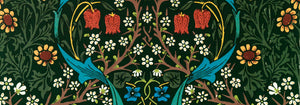
- Strawberry Thief Poster
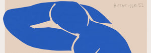
- Matisse Figuras Dançantes Poster
- Tom Krojer Exposição Poster
- Cena de Rua de Berlim Poster
- Exposição de Ernst Kirchner Poster
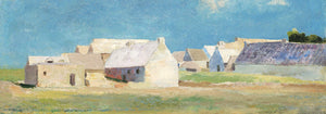
- Parque perto de Lu Poster
- El Comienzo Poster
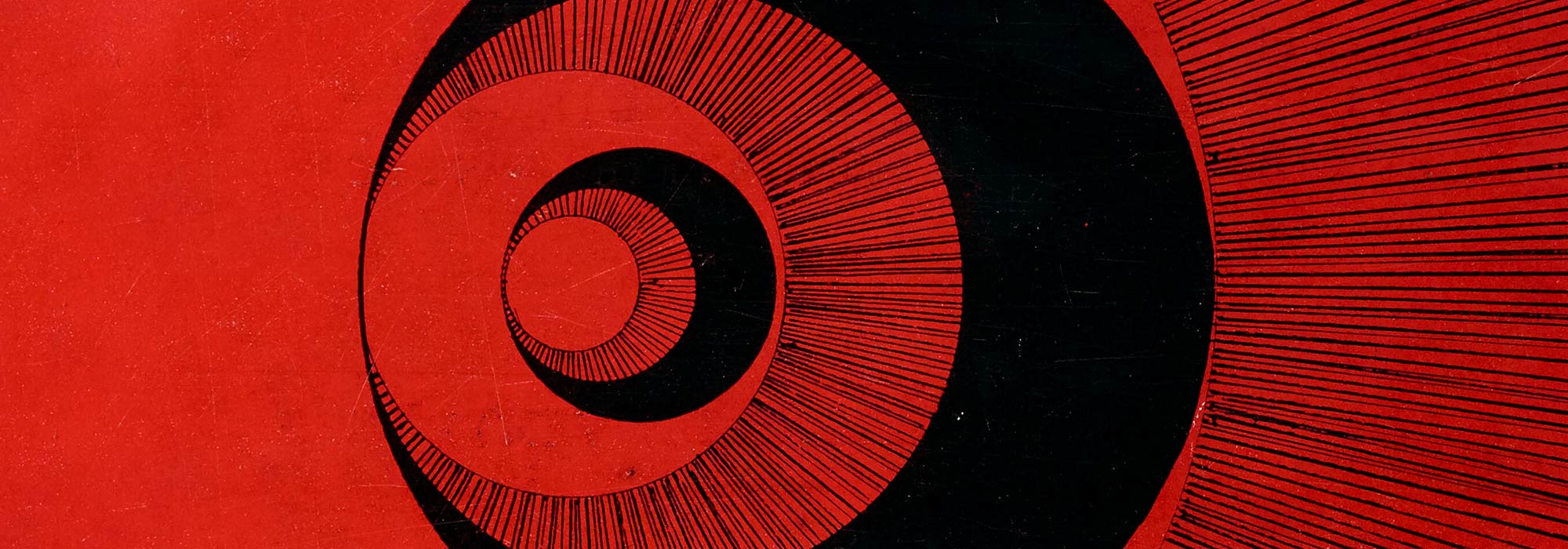
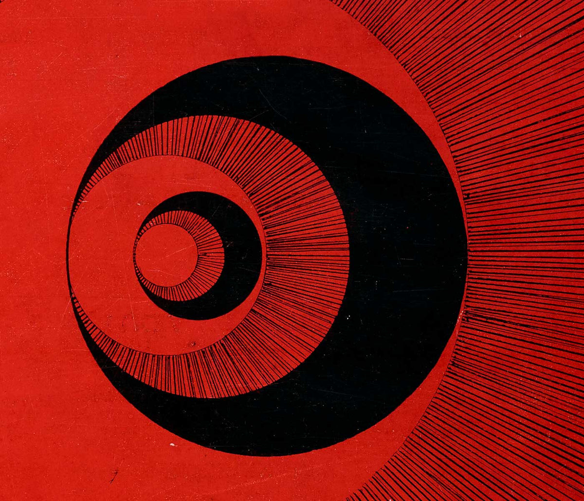
- Anel do Crepúsculo Poster
- Parler Seul Poster
- Faun and Nymphe Poster
- The Dream Poster
- Le Concert Poster
- Mulher e Pássaro à Noite Poster
- Bauhaus 20 Poster
- Bauhaus 21 Poster
- Coma mais frutas Poster
- Snoopy Come Home Poster
- Para Londres por Jet Clipper Poster
- Kyushu-Okinawa Poster
- Xerez Pedro Domecq Poster
- Balsam Aperitif Poster
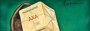
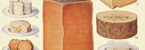
- Manteiga Poster
- Crans-sur-Sierre Poster
- Monte Carlo Poster
- Pacific Vibrations Poster
- Continental Hawaii Companhia Aérea Poster
- Gato Preto 4 Poster
- Gato Preto 3 Poster
- Cerveja e Cigarro Poster
-
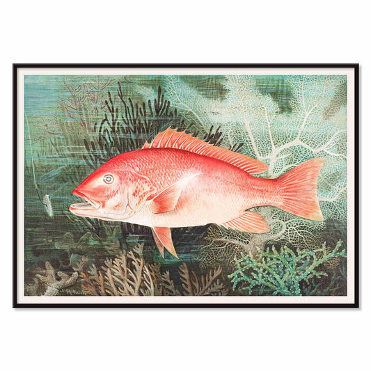
Pargo Vermelho do Norte Poster
Samuel Kilbourne · 1861 · Impressão detalhada do Pargo Vermelho do Norte com vermelhos vibrantes e rigor anatómico
Poster desde €9 · Emoldurado desde €16
Preço normal A partir de €6,00Preço normal -
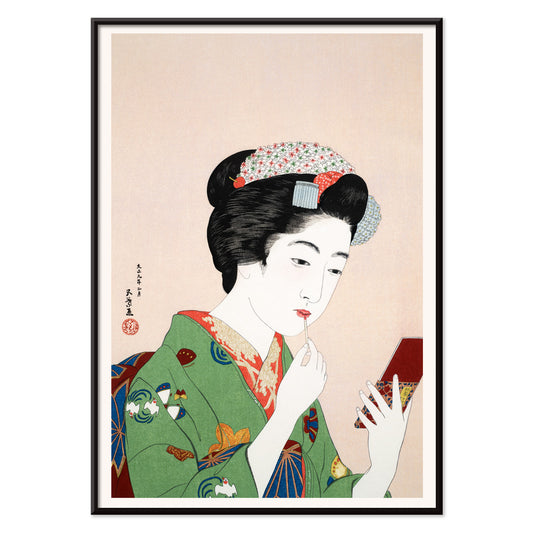
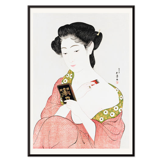
Mulher a aplicar rubor Poster
Goyō Hashiguchi · 1920 · Intimista impressão artística bijin-ga de uma mulher a aplicar rubor num ritual diário tranquilo
Poster desde €9 · Emoldurado desde €16
Preço normal A partir de €6,00Preço normal -
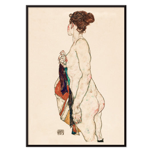
Mulher Nua de Pé Poster
Egon Schiele · 1917 · Expressiva impressão artística de nu de pé com traço angular em papel bege
Poster desde €9 · Emoldurado desde €16
Preço normal A partir de €6,00Preço normal -
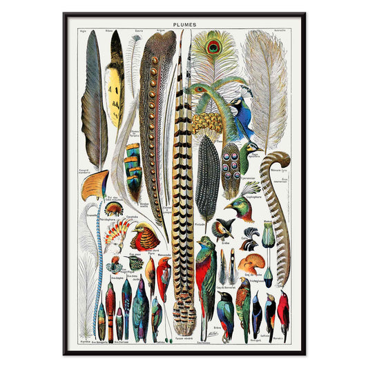
Penas Poster
Adolphe Millot · 1900 · Impressão detalhada de tipos de penas dispostos como placa de espécimes
Poster desde €9 · Emoldurado desde €16
Preço normal A partir de €6,00Preço normal -
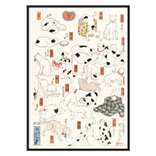
Gatos Poster
Utagawa Kuniyoshi · 1849 · Alegre impressão ukiyo-e de gatos com traço de tinta nítido e toques vermelhos
Poster desde €9 · Emoldurado desde €16
Preço normal A partir de €6,00Preço normal -
Duas Mulheres Abraçadas Poster
Egon Schiele · 1913 · Impressão artística intimista de duas mulheres entrelaçadas em tons bege e vermelho
Poster desde €9 · Emoldurado desde €16
Preço normal A partir de €6,00Preço normal -
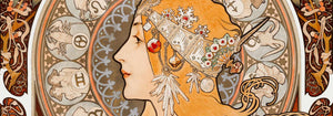
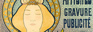
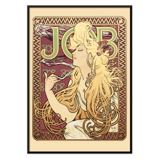
Job Poster
Alphonse Mucha · 1896 · Icónico poster Art Nouveau com perfil sensual e cabelo ornamental em cascata
Poster desde €9 · Emoldurado desde €16
Preço normal A partir de €6,00Preço normal -
Mulher a aplicar pó Poster
Goyō Hashiguchi · 1918 · Elegante impressão artística bijin-ga de uma mulher a aplicar pó pela manhã em luz serena
Poster desde €9 · Emoldurado desde €16
Preço normal A partir de €6,00Preço normal -
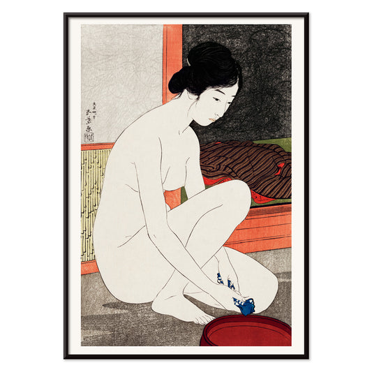
Yokugo no onna Poster
Goyō Hashiguchi · 1915 · Refinada impressão artística de mulher a banhar-se com pele pálida, cabelo escuro e toques vermelhos
Poster desde €9 · Emoldurado desde €16
Preço normal A partir de €6,00Preço normal -
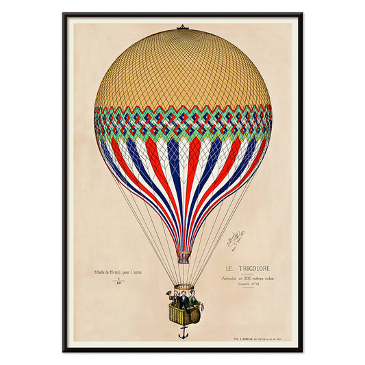
Balão tricolor Poster
Artista desconhecido · 1874 · Poster de balão tricolor sobre Paris em cores da bandeira francesa
Poster desde €9 · Emoldurado desde €16
Preço normal A partir de €6,00Preço normal -
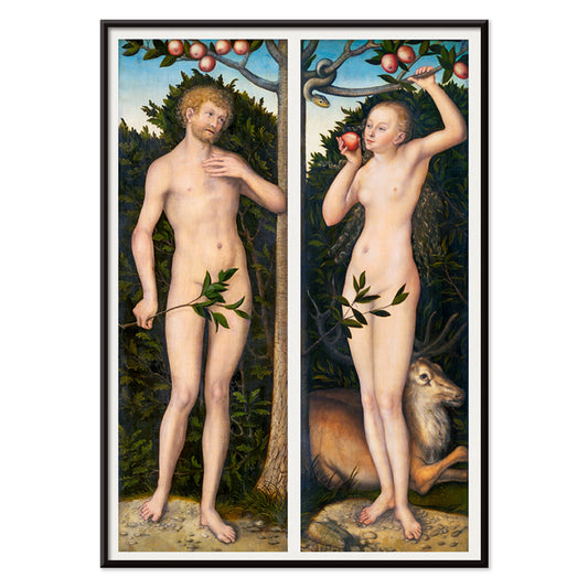
Adão e Eva Poster
Lucas Cranach · 1535 · Elegante impressão renascentista de Adão e Eva junto à árvore tentadora
Poster desde €9 · Emoldurado desde €16
Preço normal A partir de €6,00Preço normal -
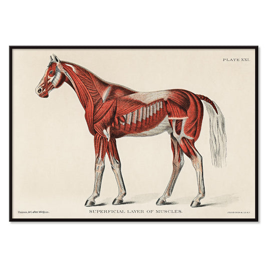
Camada superficial dos músculos do cavalo Poster
Artista desconhecido · 1904 · Impressão científica detalhada da anatomia equina com músculos superficiais em vermelho e etiquetas numeradas
Poster desde €9 · Emoldurado desde €16
Preço normal A partir de €6,00Preço normal -
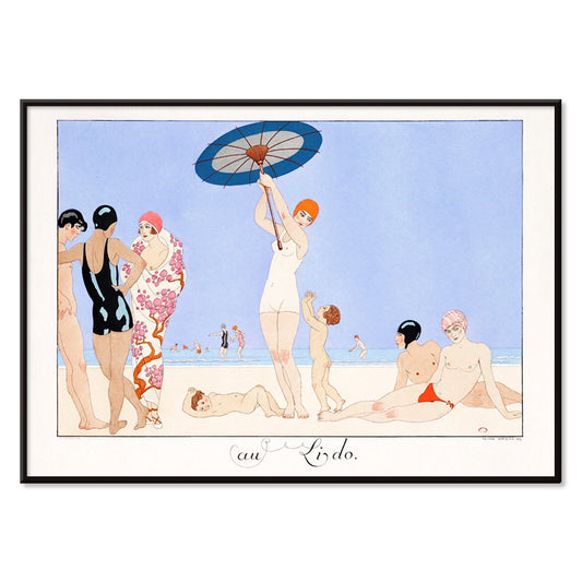
Au Lido Poster
George Barbier · 1920 · Elegante poster Art Deco com figuras alongadas, guarda-sóis e serena cena costeira
Poster desde €9 · Emoldurado desde €16
Preço normal A partir de €6,00Preço normal -
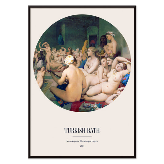
O Banho Turco Poster
Jean Auguste Dominique Ingres · 1863 · Impressão artística orientalista e sensual com banhistas entrelaçadas numa vinheta circular luminosa
Poster desde €9 · Emoldurado desde €16
Preço normal A partir de €6,00Preço normal -
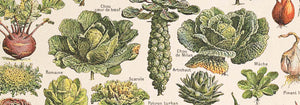
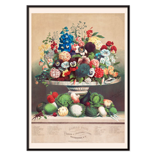
Flores e Legumes Poster
Anton Carl Rahn · 1800 · Refinada impressão artística de natureza-morta com flores e legumes recém-colhidos em bege
Poster desde €9 · Emoldurado desde €16
Preço normal A partir de €6,00Preço normal -
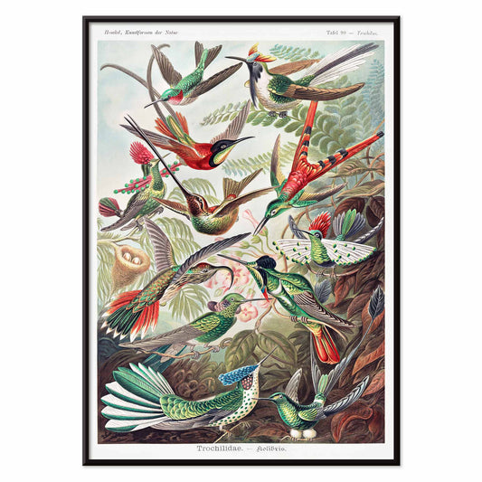
Trochilidae Poster
Ernst Haeckel · 1904 · Impressão científica detalhada de beija-flores que combina precisão da história natural com elegância ornamental
Poster desde €9 · Emoldurado desde €16
Preço normal A partir de €6,00Preço normal -
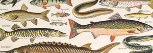
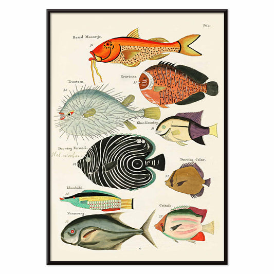
Ilustrações surreais de peixes Poster
Louis Renard · 1754 · Impressão vívida de peixes exóticos com colorido manual e estilo teatral de história natural
Poster desde €9 · Emoldurado desde €16
Preço normal A partir de €6,00Preço normal -
Formas das Folhas Poster
Marcius Willson · 1890 · Impressão botânica educativa com formas rotuladas e suaves tons verdes
Poster desde €9 · Emoldurado desde €16
Preço normal A partir de €6,00Preço normal -
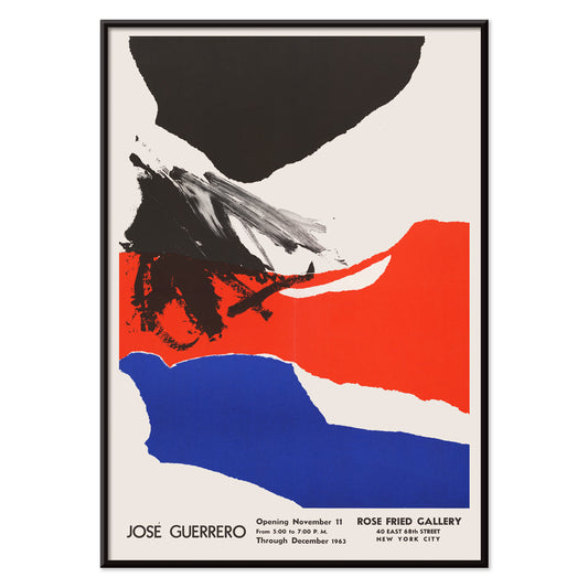
Rose Fried Gallery Poster
José Guerrero · 1963 · Poster abstrato enérgico equilibrando gestos pretos, vermelhos e azuis sobre espaço branco
Poster desde €9 · Emoldurado desde €16
Preço normal A partir de €6,00Preço normal -
Acorde e leia Poster
Artista desconhecido · 1961 · Poster de campanha modernista sobre leitura com tipografia marcante e contraste nítido a vermelho e azul
Poster desde €9 · Emoldurado desde €16
Preço normal A partir de €6,00Preço normal -
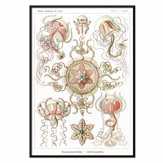
Trachomedusae Poster
Ernst Haeckel · 1904 · Intrincada impressão científica de medusas com tentáculos fluidos e translucidez natural em tons marinhos
Poster desde €9 · Emoldurado desde €16
Preço normal A partir de €6,00Preço normal -
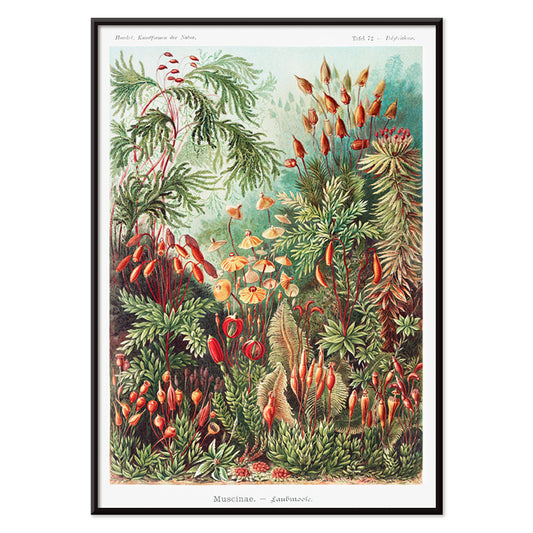
Muscinae–Laubmoose Poster
Ernst Haeckel · 1904 · Impressão científica detalhada de musgos folhosos dispostos como estudo de gabinete natural
Poster desde €9 · Emoldurado desde €16
Preço normal A partir de €6,00Preço normal -
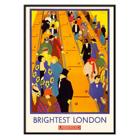
Brightest London 2 Poster
Horace Taylor · 1924 · Poster dinâmico do London Underground com multidões nas escadas-rolantes e blocos Art Deco
Poster desde €9 · Emoldurado desde €16
Preço normal A partir de €6,00Preço normal -
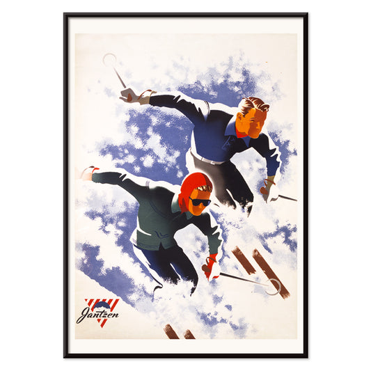
Jantzen 2 Poster
Joseph Binder · 1952 · Poster dinâmico de esqui com casal estilizado e blocos ousados em azul branco e vermelho
Poster desde €9 · Emoldurado desde €16
Preço normal A partir de €6,00Preço normal -
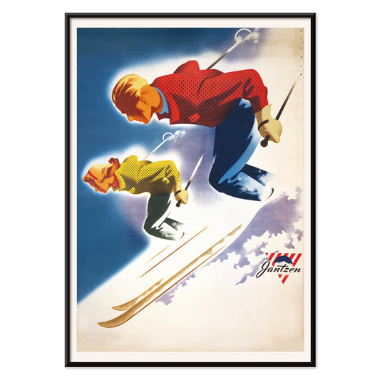
Jantzen Poster
Joseph Binder · 1952 · Poster enérgico de esqui com casal estilizado entre formas alpinas marcantes
Poster desde €9 · Emoldurado desde €16
Preço normal A partir de €6,00Preço normal -
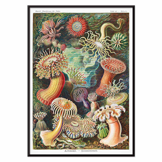
Actiniae Poster
Ernst Haeckel · 1904 · Poster científico detalhado de anémonas com tentáculos radiantes como jóias marinhas
Poster desde €9 · Emoldurado desde €16
Preço normal A partir de €6,00Preço normal -
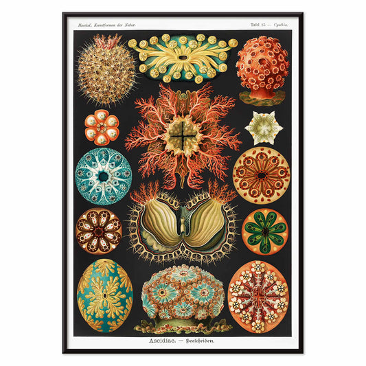
Ascidiae Poster
Ernst Haeckel · 1904 · Detalhada impressão científica de ascídias organizada numa prancha simétrica de história natural
Poster desde €9 · Emoldurado desde €16
Preço normal A partir de €6,00Preço normal -
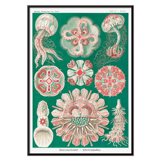
Discomedusae Poster
Ernst Haeckel · 1904 · Impressão científica detalhada de medusas com sinos flutuantes e tentáculos rendilhados
Poster desde €9 · Emoldurado desde €16
Preço normal A partir de €6,00Preço normal -
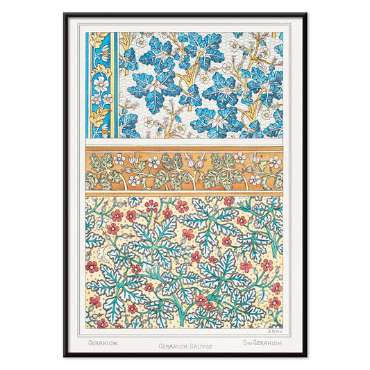
Gerânio selvagem Poster
Maurice Pillard Verneuil · 1896 · Poster de gerânio selvagem estilizado com curvas Art Nouveau fluidas e folhagem padronizada
Poster desde €9 · Emoldurado desde €16
Preço normal A partir de €6,00Preço normal -
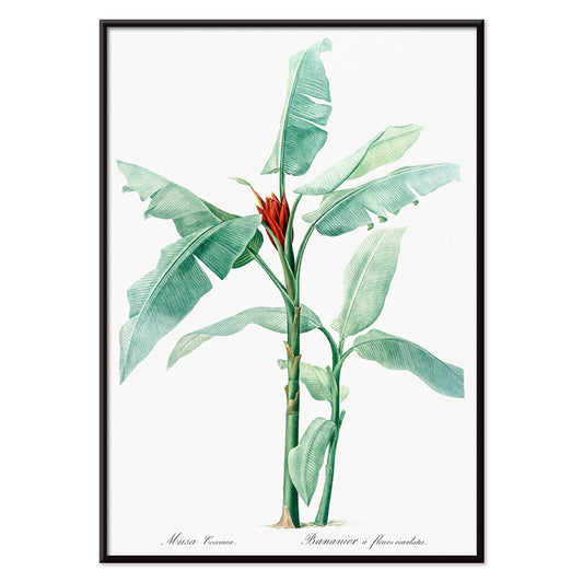
Banana escarlate Poster
Pierre-Joseph Redouté · 1805 · Elegante impressão botânica de banana escarlate com folhas verdes nítidas e flor vermelha viva
Poster desde €9 · Emoldurado desde €16
Preço normal A partir de €6,00Preço normal -
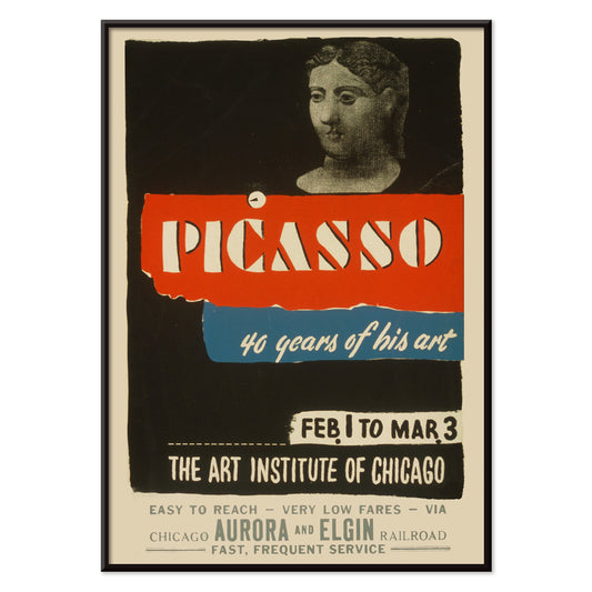
Picasso - 40 anos da sua obra Poster
Art Institute of Chicago · 1970 · Poster de exposição marcante com tipografia arrojada e figura abstrata em vermelho e azul
Poster desde €9 · Emoldurado desde €16
Preço normal A partir de €6,00Preço normal -
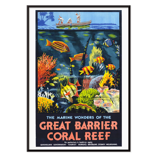
Maravilhas Marinhas Poster
Percival Albert Trompf · 1933 · Poster Art Déco da Grande Barreira de Coral com peixes e corais vívidos em azul profundo
Poster desde €9 · Emoldurado desde €16
Preço normal A partir de €6,00Preço normal -
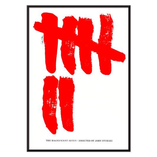
Os Sete Magníficos Poster
Saul Bass · 1960 · Poster minimalista de western com sete marcas vermelhas em traço de pincel em fundo branco
Poster desde €9 · Emoldurado desde €16
Preço normal A partir de €6,00Preço normal -
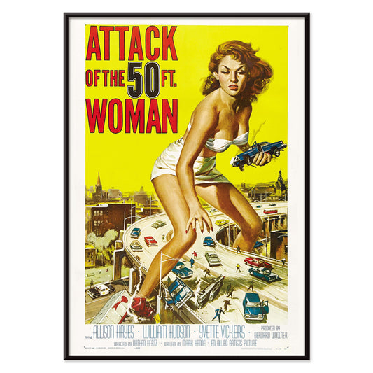
Attack of the 50ft Women Poster
Reynold Brown · 1958 · Poster de ficção científica de alta tensão com mulher gigante dominando carros e ruas da cidade
Poster desde €9 · Emoldurado desde €16
Preço normal A partir de €6,00Preço normal -
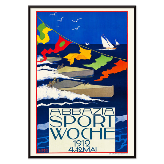
Abbazia Sport Woche Poster
Stefanie Glax · 1912 · Dinâmico poster de regata com velas arrojadas cruzando azuis intensos e luz costeira
Poster desde €9 · Emoldurado desde €16
Preço normal A partir de €6,00Preço normal -
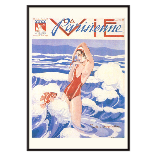
La Vie Parisienne Poster
Umberto Brunelleschi · 1932 · Poster Art Deco com mulher em fato de banho vermelho sobre azul e branco
Poster desde €9 · Emoldurado desde €16
Preço normal A partir de €6,00Preço normal


36/761 items
- Mulher a aplicar rubor Poster
- Mulher Nua de Pé Poster
- Penas Poster
- Gatos Poster
- Duas Mulheres Abraçadas Poster
- Job Poster
- Mulher a aplicar pó Poster
- Yokugo no onna Poster
- Balão tricolor Poster
- Au Lido Poster
- Trochilidae Poster
- Ilustrações surreais de peixes Poster
- Formas das Folhas Poster
- Rose Fried Gallery Poster
- Acorde e leia Poster
- Muscinae–Laubmoose Poster
- Actiniae Poster
- Gerânio selvagem Poster
- Maravilhas Marinhas Poster
- Os Sete Magníficos Poster
- Attack of the 50ft Women Poster
- Abbazia Sport Woche Poster
- La Vie Parisienne Poster
Vermelho, o acento mais intencional
Na colecção Vermelho, a cor funciona menos como assunto e mais como sinal: uma mancha de papoila, um título envernizado, um rubor quente no papel. Estes pósters circulam entre ilustração, modernismo, gráficos de viagem e gravuras diagramáticas, e ainda assim cada peça depende do vermelho para dirigir a atenção. Vermelhão sobre creme, tijolo contra grafite ou uma única forma escarlate em espaço sereno pode alterar a leitura de uma divisão. Como arte mural, o vermelho age como tempero na decoração: um pequeno pormenor energiza um quadro colectivo, enquanto um campo maior estabelece um ponto focal e um sentido de direcção na composição.
Ofício, pigmento e a arte da persuasão
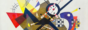
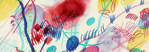
O vermelho carregou peso técnico e cultural ao longo da história do impresso. Corantes e pigmentos antigos como a cochonilha e a alizarina marcaram têxteis e as artes decorativas, enquanto a litografia tornou a tipografia vermelha e os campos planos de cor centrais na cultura visual pública. Strawberry Thief (1883) de William Morris utiliza o vermelho como nota estrutural dentro da repetição, mantendo pássaros e frutos em tensão rítmica. Em Hygieia (1907) de Gustav Klimt, o manto lê-se tanto como emblema quanto aviso, com o carmim a funcionar como fronteira em redor da figura. Heavy Red (1924) de Wassily Kandinsky mostra o vermelho como massa, um plano que impulsiona formas adjacentes ao movimento e torna a geometria sensorial.
Onde os pósters vermelhos vivem melhor
Os acentos vermelhos assentam de forma natural junto a materiais honestos: nogueira, terracota, latão, linho e pedra envelhecida. Em cozinhas e cantos de refeições, estudos de fruta e imagens vegetais ecoam as cores da mesa e da cerâmica, o que torna as impressões Botânica companheiras naturais da decoração em vermelho. Em corredores e entradas, um elemento vermelho e marcante ajuda a puxar o olhar por um espaço estreito; a lógica gráfica da Publicidade funciona bem com espelhos, cabideiros e soalho mais escuro. Para quartos, mantenha o vermelho menor e mais quente, inclinando-se para tons tijolo ou rosa envelhecido em vez do escarlate primário, e equilibre com roupa de cama pálida e luz âmbar baixa. Se a divisão abre para vegetação, o vermelho torna-se contraponto claro; cenas mais contidas da secção Paisagens ajudam a manter a paleta ancorada.
Combinações, molduras e construir uma parede de quadros
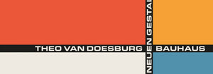
Para evitar que o vermelho domine, trate-o como uma voz dentro de uma paleta medida. Uma passe-partout branca dá respiro ao vermelho, enquanto uma moldura preta fina aguça áreas saturadas e ecoa a disciplina das imagens Preto e Branco. Para emparelhamentos estruturados, coloque um póster guiado pelo vermelho ao lado de obra geométrica da Bauhaus, onde o vermelho surge frequentemente como bloco controlado em vez de floreio. Para um registo mais teatral, Cachou Lajaunie (1920) de Leonetto Cappiello actua como candeeiro de rua contra tons de madeira profunda e paredes amorteçadas. Ao dispor uma parede de quadros, repita o vermelho duas vezes, uma vez como área maior e outra como pequeno acento, para que o olhar encontre um percurso claro entre as impressões.
Uma reflexão final sobre o vermelho
O vermelho é também uma pista útil para ler imagens: em gráficos de viagem sinaliza calor, vida nocturna e apetite; em composições modernistas marca o ponto onde a atenção errante prende-se no foco. Por isso esta selecção pode saltar do padrão à figura simbolista até à abstração de bordas duras sem perder coerência. Deixe espaço de respiro em redor do campo vermelho mais ruidoso, e permita que impressões vizinhas assumam tons mais suaves como areia, tinta e verde água. Usado assim, o vermelho torna-se ritmo em vez de ruído, e a decoração começa a sentir-se intencional sem se tornar rígida.