


- Cebolas Poster
- Rabanetes Poster
- Casal a dançar na neve Poster
- Jet Clipper para o Hawaii Poster
- Campari Soda Poster
- Bec-Kina Poster
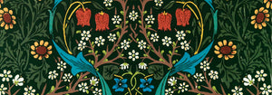
- Strawberry Thief Poster
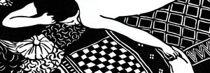
- Matisse Figuras Dançantes Poster
- Tom Krojer Exposição Poster
- Cena de Rua de Berlim Poster
- Exposição de Ernst Kirchner Poster
- Parque perto de Lu Poster
- El Comienzo Poster
- Anel do Crepúsculo Poster
- Parler Seul Poster
- Faun and Nymphe Poster
- The Dream Poster
- Le Concert Poster
- Mulher e Pássaro à Noite Poster
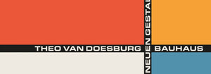
- Bauhaus 20 Poster
- Bauhaus 21 Poster
- Coma mais frutas Poster
- Snoopy Come Home Poster
- Para Londres por Jet Clipper Poster
- Kyushu-Okinawa Poster
- Xerez Pedro Domecq Poster
- Balsam Aperitif Poster
- Manteiga Poster
- Crans-sur-Sierre Poster
- Monte Carlo Poster
- Pacific Vibrations Poster
- Continental Hawaii Companhia Aérea Poster
- Gato Preto 4 Poster
- Gato Preto 3 Poster
- Cerveja e Cigarro Poster
-
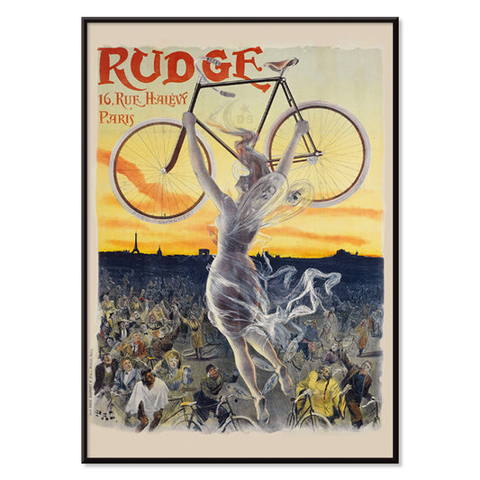
Rudge Poster
Jean de Paleologue · 1898 · Poster Art Nouveau com musa alada a erguer uma bicicleta brilhante sobre a multidão
Poster desde €9 · Emoldurado desde €16
Preço normal A partir de €6,00Preço normal -
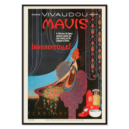
Vivaudous Mavis Poster
Fred L. Parker · 1920 · Glamouroso poster Art Deco de perfume com figura elegante e frascos em tons joia
Poster desde €9 · Emoldurado desde €16
Preço normal A partir de €6,00Preço normal -
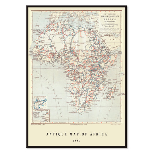
Mapa antigo de África Poster
Institute of Leipzig · 1851 · Impressão vintage detalhada de África com coordenadas em grelha e topónimos densos
Poster desde €9 · Emoldurado desde €16
Preço normal A partir de €6,00Preço normal -
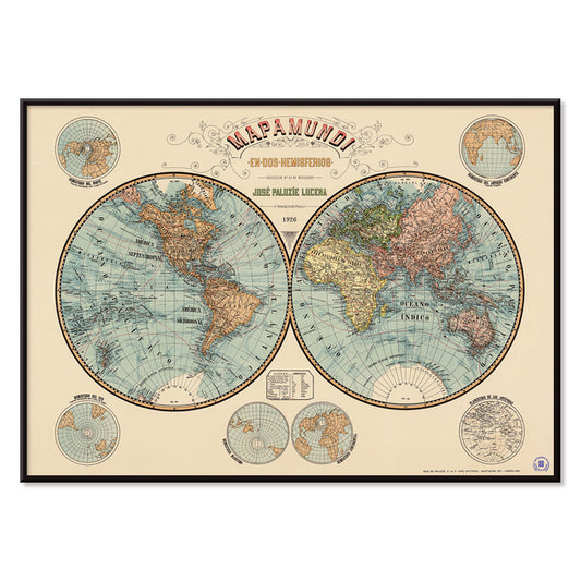
Mapa-múndi Poster
Josep Paluzie Lucena · 1900 · Poster vintage de mapa-múndi detalhado com oceanos azuis e papel bege quente
Poster desde €9 · Emoldurado desde €16
Preço normal A partir de €6,00Preço normal -
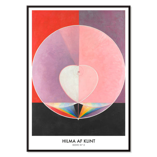
Pombas No. 2 Poster
Hilma af Klint · 1915 · Lírica impressão artística abstrata com simbolismo da pomba e formas geométricas em tons pastel
Poster desde €9 · Emoldurado desde €16
Preço normal A partir de €6,00Preço normal -
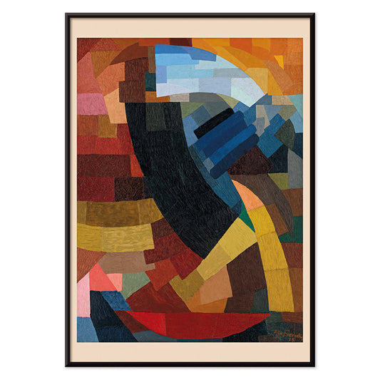
Fragmentos de figura Poster
Otto Freundlich · 1928 · Vibrante poster geométrico de figura fragmentada com contornos pretos marcantes
Poster desde €9 · Emoldurado desde €16
Preço normal A partir de €6,00Preço normal -
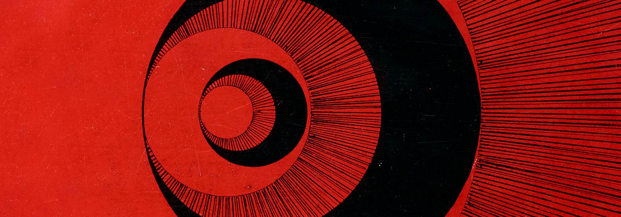
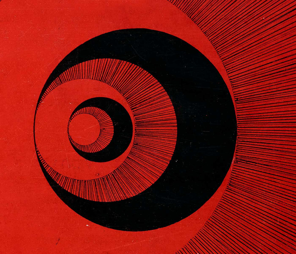
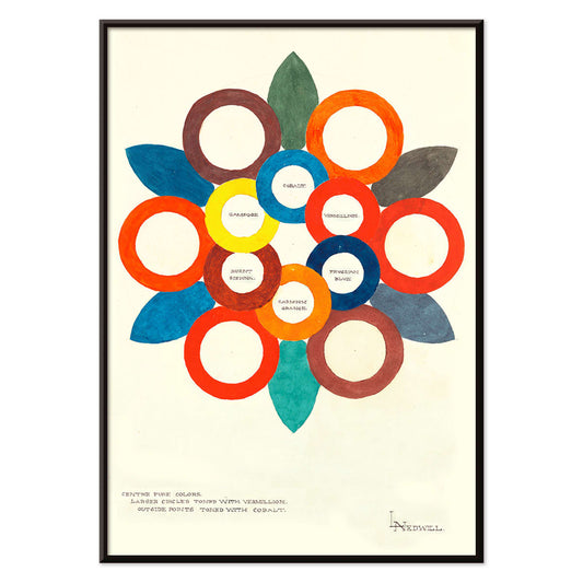
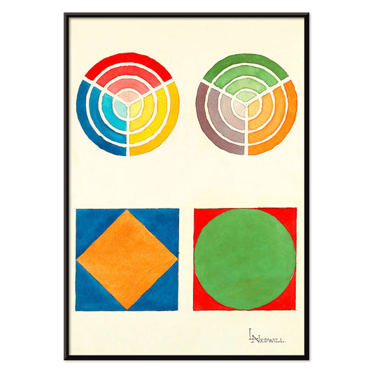
Centre Pure Colors Poster
Elizabeth A. Nedwill · 1900 · Poster abstrato em forma de roda de cores com anéis sobrepostos em tons quentes e frios
Poster desde €9 · Emoldurado desde €16
Preço normal A partir de €6,00Preço normal -
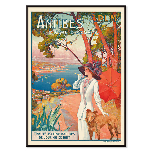
Antibes Poster
David Dellepiane · 1910 · Poster Belle Époque de Antibes com mulher elegante e cão junto ao Mediterrâneo
Poster desde €9 · Emoldurado desde €16
Preço normal A partir de €6,00Preço normal -
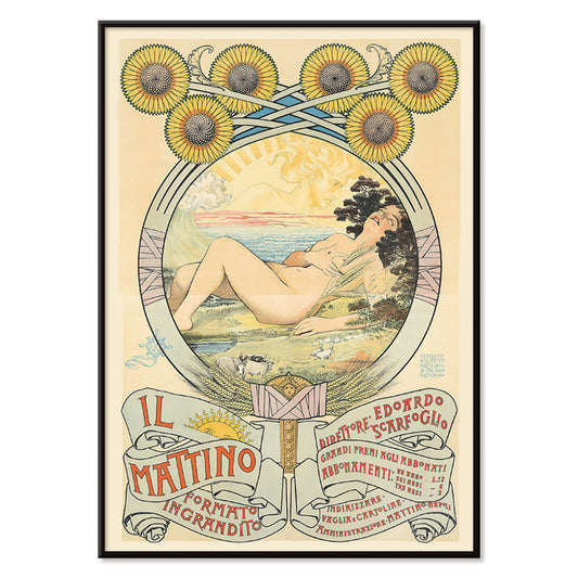
II Mattino Poster
Giovanni Mataloni · 1896 · Poético poster Art Nouveau com mulher reclinada emoldurada por girassóis radiantes
Poster desde €9 · Emoldurado desde €16
Preço normal A partir de €6,00Preço normal -
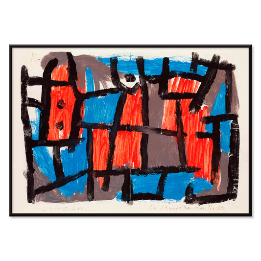
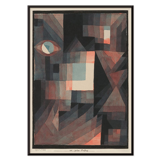
The Hour Before One Night Poster
Paul Klee · 1940 · poster abstrato onírico com linhas pretas e formas vermelhas e azuis sobre fundo cinzento
Poster desde €9 · Emoldurado desde €16
Preço normal A partir de €6,00Preço normal -
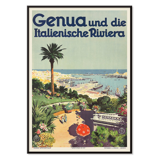
Génova Poster
Aurelio Craffonara · 1931 · Poster de Génova ensolarada com barcos estilizados e silhuetas costeiras nítidas
Poster desde €9 · Emoldurado desde €16
Preço normal A partir de €6,00Preço normal -
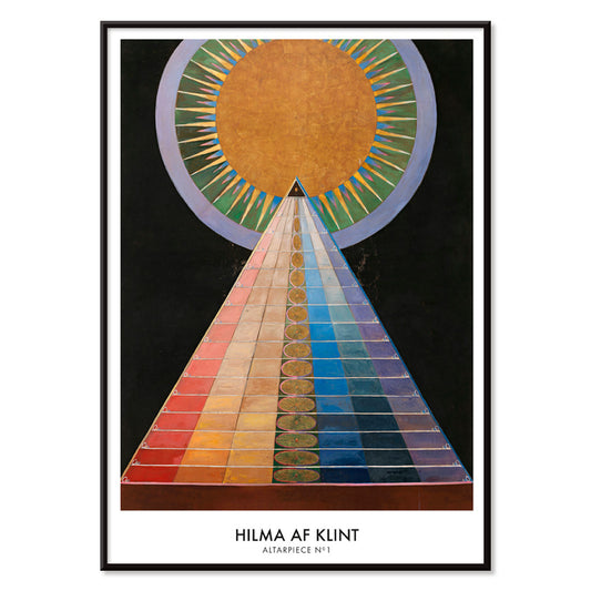
Retábulo n.º 1 Poster
Hilma af Klint · 1915 · Brilhante impressão artística geométrica com motivo solar central e formas marcantes sobre preto
Poster desde €9 · Emoldurado desde €16
Preço normal A partir de €6,00Preço normal -
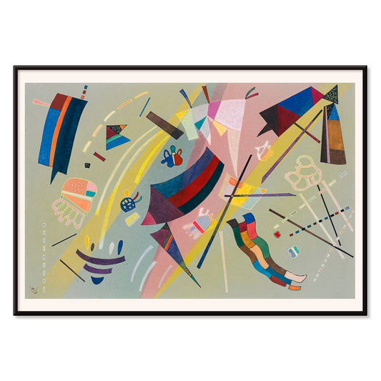
Sans Titre (1941) Poster
Wassily Kandinsky · 1941 · Lírico poster abstrato com formas geométricas flutuantes em azul, amarelo, rosa e vermelho
Poster desde €9 · Emoldurado desde €16
Preço normal A partir de €6,00Preço normal -
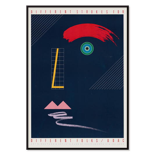
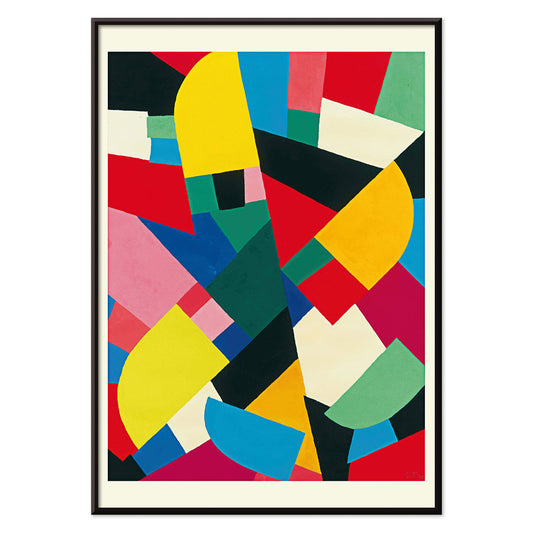
Traços diferentes para pessoas diferentes Poster
McRay Magleby · 1942 · Poster geométrico que celebra a individualidade com blocos de cor vibrantes
Poster desde €9 · Emoldurado desde €16
Preço normal A partir de €6,00Preço normal -
Gradiente vermelho e verde Poster
Paul Klee · 1921 · Poster modernista abstrato com blocos graduados vermelhos e verdes e linhas pretas finas
Poster desde €9 · Emoldurado desde €16
Preço normal A partir de €6,00Preço normal -
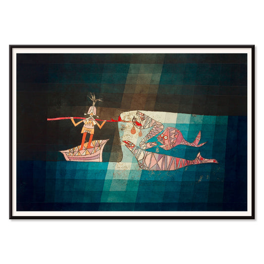
The Seafarer Poster
Paul Klee · 1923 · Poster abstrato e lúdico de marinheiro com símbolos rítmicos que evocam música e mar
Poster desde €9 · Emoldurado desde €16
Preço normal A partir de €6,00Preço normal -
Area Broken by Perpendiculars Poster
Joseph Schillinger · 1934 · Poster geométrico abstrato com grelhas perpendiculares e blocos de cor rítmicos
Poster desde €9 · Emoldurado desde €16
Preço normal A partir de €6,00Preço normal -
Composition Abstraite Poster
Otto Freundlich · 1937 · Vibrante impressão artística geométrica com blocos de cor entrelaçados delineados em preto
Poster desde €9 · Emoldurado desde €16
Preço normal A partir de €6,00Preço normal -
Komposition Poster
Otto Freundlich · 1936 · Vibrante impressão artística geométrica com planos de cor entrelaçados e energia modernista
Poster desde €9 · Emoldurado desde €16
Preço normal A partir de €6,00Preço normal -
Osnovnoye Design Poster
Gustavs Klucis · 1920 · Dinâmico poster construtivista com tipografia cirílica e formas geométricas vermelhas
Poster desde €9 · Emoldurado desde €16
Preço normal A partir de €6,00Preço normal -
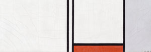
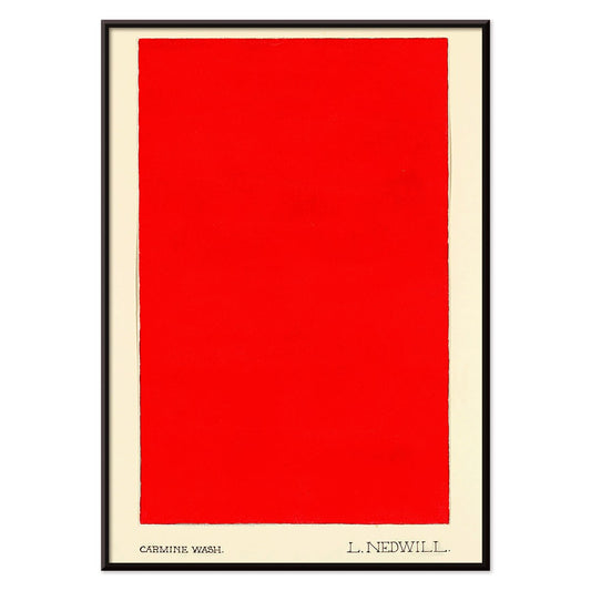
Carmine Wash Poster
Elizabeth A. Nedwill · 1900 · Impressão artística minimalista com um bloco carmim sobre fundo marfim
Poster desde €9 · Emoldurado desde €16
Preço normal A partir de €6,00Preço normal -
Ornamento histórico Poster
Elizabeth A. Nedwill · 1900 · Vibrante impressão vintage geométrica que equilibra ornamento histórico e ritmo moderno
Poster desde €9 · Emoldurado desde €16
Preço normal A partir de €6,00Preço normal -
Patchwork de Cores Poster
Otto Freundlich · 1936 · Poster abstrato vibrante com blocos coloridos interligados e contornos negros marcantes
Poster desde €9 · Emoldurado desde €16
Preço normal A partir de €6,00Preço normal -
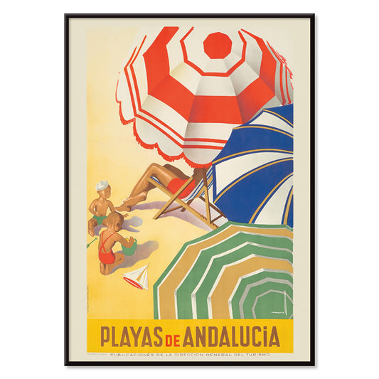
Praias da Andaluzia Poster
José Morell · 1939 · Vibrante poster andaluz com banhistas, mar azul, barcos e tipografia ousada
Poster desde €9 · Emoldurado desde €16
Preço normal A partir de €6,00Preço normal -
Ilhas do Mar do Sul Poster
Paul George Lawler · 1938 · Vibrante Poster de viagem Ilhas do Mar do Sul com hidroavião Pan Am e costa tropical
Poster desde €9 · Emoldurado desde €16
Preço normal A partir de €6,00Preço normal -
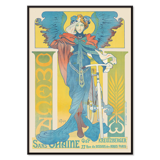
Omega Poster
Henri Thiriet · 1897 · Poster Art Nouveau com bicicleta e mulher alada em intensos tons de azul
Poster desde €9 · Emoldurado desde €16
Preço normal A partir de €6,00Preço normal -
La Grande Roue Poster
Artista desconhecido · 1899 · Poster da Belle Époque de Paris com mulheres elegantes junto à roda da Exposição ao pôr-do-sol
Poster desde €9 · Emoldurado desde €16
Preço normal A partir de €6,00Preço normal -
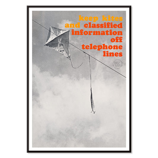
Papagaios fora das linhas telefónicas Poster
Artista desconhecido · 1964 · Poster de segurança arrojado com papagaio enredado em linhas telefónicas a preto e branco
Poster desde €9 · Emoldurado desde €16
Preço normal A partir de €6,00Preço normal -
Exposição Internacional de Aguarelas Poster
Arlington Gregg · 1939 · Poster gráfico com blocos de cores primárias e pincel em copo
Poster desde €9 · Emoldurado desde €16
Preço normal A partir de €6,00Preço normal -
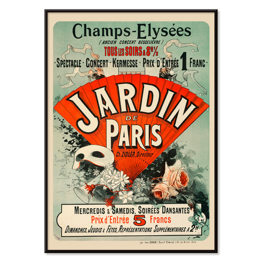
Jardin De Paris Poster
Jules Chéret · 1884 · Poster Belle Époque alegre com dançarina em movimento, máscaras e motivos florais
Poster desde €9 · Emoldurado desde €16
Preço normal A partir de €6,00Preço normal -
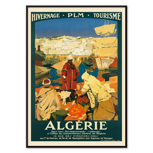
Argélia Poster
Léon Cauvy · 1930 · Vibrante poster da Argélia com tipografia marcante e atmosfera mediterrânica banhada de sol
Poster desde €9 · Emoldurado desde €16
Preço normal A partir de €6,00Preço normal -
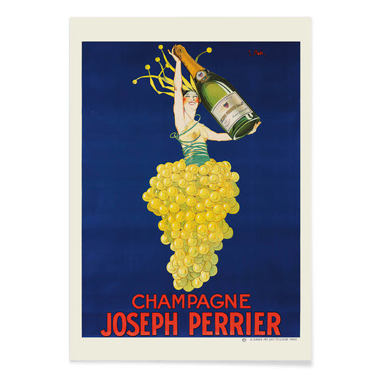
Champagne Joseph Perrier Poster
Joseph Stall · 1902 · Poster festivo de champanhe com figura elegante e cachos de uvas em cores vivas
Poster desde €9 · Emoldurado desde €16
Preço normal A partir de €6,00Preço normal -
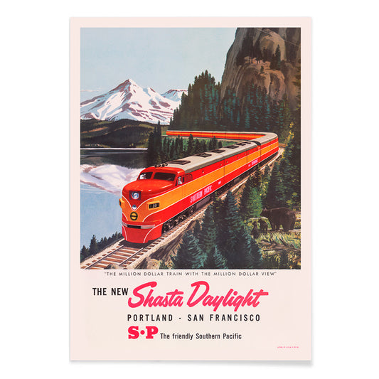
Shasta Daylight Portland–San Francisco Poster
Artista desconhecido · 1950 · Poster com comboio vermelho aerodinâmico a curvar-se por paisagem montanhosa em gráficos nítidos
Poster desde €9 · Emoldurado desde €16
Preço normal A partir de €6,00Preço normal -
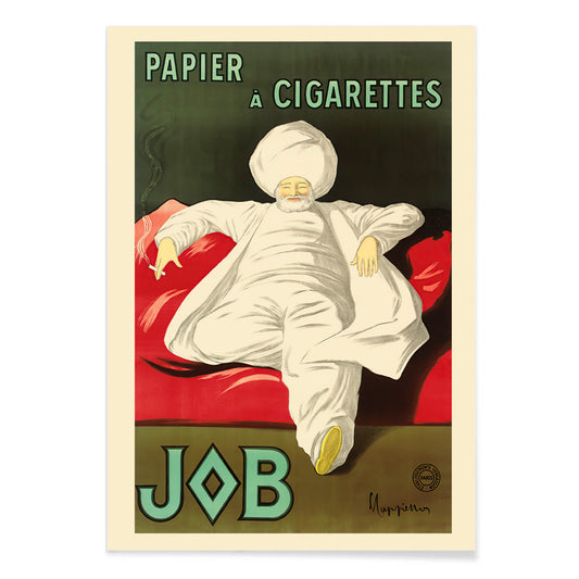
Papel de Enrolar para Cigarros Poster
Leonetto Cappiello · 1933 · Elegante poster publicitário com figura de túnica branca sobre verde vivo
Poster desde €9 · Emoldurado desde €16
Preço normal A partir de €6,00Preço normal -
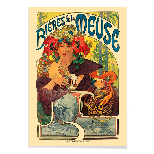
Bières De La Meuse Poster
Alphonse Mucha · 1897 · Poster Art Nouveau luminoso de cerveja com musa coroada de flores e cabelos ondulantes
Poster desde €9 · Emoldurado desde €16
Preço normal A partir de €6,00Preço normal -
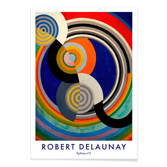
Rythme n°2 Poster
Robert Delaunay · 1938 · Impressão artística de ritmo abstrato com círculos entrelaçados e arcos em primários vibrantes
Poster desde €9 · Emoldurado desde €16
Preço normal A partir de €6,00Preço normal


36/761 items
- Rudge Poster
- Vivaudous Mavis Poster
- Mapa-múndi Poster
- Pombas No. 2 Poster
- Fragmentos de figura Poster
- Centre Pure Colors Poster
- Antibes Poster
- Génova Poster
- Retábulo n.º 1 Poster
- Sans Titre (1941) Poster
- Traços diferentes para pessoas diferentes Poster
- Area Broken by Perpendiculars Poster
- Komposition Poster
- Carmine Wash Poster
- Ornamento histórico Poster
- Patchwork de Cores Poster
- Praias da Andaluzia Poster
- Ilhas do Mar do Sul Poster
- La Grande Roue Poster
- Papagaios fora das linhas telefónicas Poster
- Jardin De Paris Poster
- Champagne Joseph Perrier Poster
- Shasta Daylight Portland–San Francisco Poster
- Papel de Enrolar para Cigarros Poster
- Rythme n°2 Poster
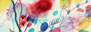
Vermelho, o acento mais intencional
Na colecção Vermelho, a cor funciona menos como assunto e mais como sinal: uma mancha de papoila, um título envernizado, um rubor quente no papel. Estes pósters circulam entre ilustração, modernismo, gráficos de viagem e gravuras diagramáticas, e ainda assim cada peça depende do vermelho para dirigir a atenção. Vermelhão sobre creme, tijolo contra grafite ou uma única forma escarlate em espaço sereno pode alterar a leitura de uma divisão. Como arte mural, o vermelho age como tempero na decoração: um pequeno pormenor energiza um quadro colectivo, enquanto um campo maior estabelece um ponto focal e um sentido de direcção na composição.
Ofício, pigmento e a arte da persuasão
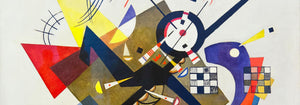
O vermelho carregou peso técnico e cultural ao longo da história do impresso. Corantes e pigmentos antigos como a cochonilha e a alizarina marcaram têxteis e as artes decorativas, enquanto a litografia tornou a tipografia vermelha e os campos planos de cor centrais na cultura visual pública. Strawberry Thief (1883) de William Morris utiliza o vermelho como nota estrutural dentro da repetição, mantendo pássaros e frutos em tensão rítmica. Em Hygieia (1907) de Gustav Klimt, o manto lê-se tanto como emblema quanto aviso, com o carmim a funcionar como fronteira em redor da figura. Heavy Red (1924) de Wassily Kandinsky mostra o vermelho como massa, um plano que impulsiona formas adjacentes ao movimento e torna a geometria sensorial.
Onde os pósters vermelhos vivem melhor
Os acentos vermelhos assentam de forma natural junto a materiais honestos: nogueira, terracota, latão, linho e pedra envelhecida. Em cozinhas e cantos de refeições, estudos de fruta e imagens vegetais ecoam as cores da mesa e da cerâmica, o que torna as impressões Botânica companheiras naturais da decoração em vermelho. Em corredores e entradas, um elemento vermelho e marcante ajuda a puxar o olhar por um espaço estreito; a lógica gráfica da Publicidade funciona bem com espelhos, cabideiros e soalho mais escuro. Para quartos, mantenha o vermelho menor e mais quente, inclinando-se para tons tijolo ou rosa envelhecido em vez do escarlate primário, e equilibre com roupa de cama pálida e luz âmbar baixa. Se a divisão abre para vegetação, o vermelho torna-se contraponto claro; cenas mais contidas da secção Paisagens ajudam a manter a paleta ancorada.
Combinações, molduras e construir uma parede de quadros
Para evitar que o vermelho domine, trate-o como uma voz dentro de uma paleta medida. Uma passe-partout branca dá respiro ao vermelho, enquanto uma moldura preta fina aguça áreas saturadas e ecoa a disciplina das imagens Preto e Branco. Para emparelhamentos estruturados, coloque um póster guiado pelo vermelho ao lado de obra geométrica da Bauhaus, onde o vermelho surge frequentemente como bloco controlado em vez de floreio. Para um registo mais teatral, Cachou Lajaunie (1920) de Leonetto Cappiello actua como candeeiro de rua contra tons de madeira profunda e paredes amorteçadas. Ao dispor uma parede de quadros, repita o vermelho duas vezes, uma vez como área maior e outra como pequeno acento, para que o olhar encontre um percurso claro entre as impressões.
Uma reflexão final sobre o vermelho
O vermelho é também uma pista útil para ler imagens: em gráficos de viagem sinaliza calor, vida nocturna e apetite; em composições modernistas marca o ponto onde a atenção errante prende-se no foco. Por isso esta selecção pode saltar do padrão à figura simbolista até à abstração de bordas duras sem perder coerência. Deixe espaço de respiro em redor do campo vermelho mais ruidoso, e permita que impressões vizinhas assumam tons mais suaves como areia, tinta e verde água. Usado assim, o vermelho torna-se ritmo em vez de ruído, e a decoração começa a sentir-se intencional sem se tornar rígida.