


- Destroy This Mad Brute Poster
- O bom vizinho da América do Sul Poster
- Itália e Cidade do Vaticano Poster
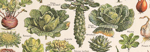
- Cebolas Poster
- Bec-Kina Poster
- Kohler Chocolat Poster
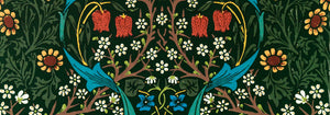
- Strawberry Thief Poster
- Tom Krojer Exposição Poster
- Exposição de Ernst Kirchner Poster
- El Comienzo Poster
- Parler Seul 2 Poster
- Anel do Crepúsculo Poster
- Parler Seul Poster
- Faun and Nymphe Poster
- The Dream Poster
- Le Concert Poster
- Pássaro atravessando uma nuvem Poster
- Artista Feminina Poster
- Revenge of the Pink Panther Poster
- Mulher e Pássaro à Noite Poster
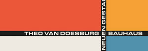
- Bauhaus 20 Poster
- Grou japonês azul Poster
- Snoopy Come Home Poster
- Para Londres por Jet Clipper Poster
- Kyushu-Okinawa Poster
- Xerez Pedro Domecq Poster
- Balsam Aperitif Poster
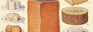
- Manteiga Poster
- Crans-sur-Sierre Poster
- Monte Carlo Poster
- Cerveja e Cigarro Poster
- Costa Oeste do México Poster
- Rita Gaufres Poster
- Hibisco Poster
-
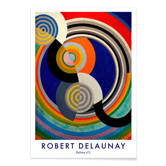
Rythme n°2 Poster
Robert Delaunay · 1938 · Impressão artística de ritmo abstrato com círculos entrelaçados e arcos em primários vibrantes
Poster desde €9 · Emoldurado desde €16
Preço normal A partir de €6,00Preço normal -
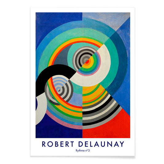
Rythme n°3 Poster
Robert Delaunay · 1938 · Poster abstrato energético de círculos concêntricos em azul, vermelho, amarelo e verde
Poster desde €9 · Emoldurado desde €16
Preço normal A partir de €6,00Preço normal -
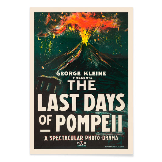
Os Últimos Dias de Pompeia Poster
H.C. Miner · 1913 · Poster de filme com erupção vulcânica dramática e tipografia arrojada
Poster desde €9 · Emoldurado desde €16
Preço normal A partir de €6,00Preço normal -
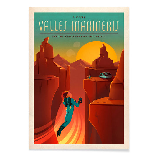
Valles Marineris Poster
SpaceX · 2015 · Poster vintage do cânion marciano com silhueta de astronauta ao pôr do sol
Poster desde €9 · Emoldurado desde €16
Preço normal A partir de €6,00Preço normal -
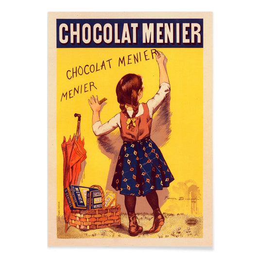
Chocolat Menier Poster
Firmin Bouisset · 1896 · Poster publicitário francês e divertido de uma menina a escrever Chocolat Menier numa parede amarela
Poster desde €9 · Emoldurado desde €16
Preço normal A partir de €6,00Preço normal -
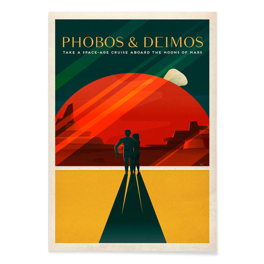
Phobos e Deimos Poster
SpaceX · 2020 · Poster de viagem retrô a Marte com casal sob Phobos e Deimos em tons vermelhos
Poster desde €9 · Emoldurado desde €16
Preço normal A partir de €6,00Preço normal -
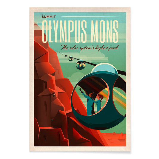
Olympus Mons Poster
SpaceX · 2021 · Poster retrofuturista de viagem a Marte com teleféricos a subir as encostas rubras do Olympus Mons
Poster desde €9 · Emoldurado desde €16
Preço normal A partir de €6,00Preço normal -
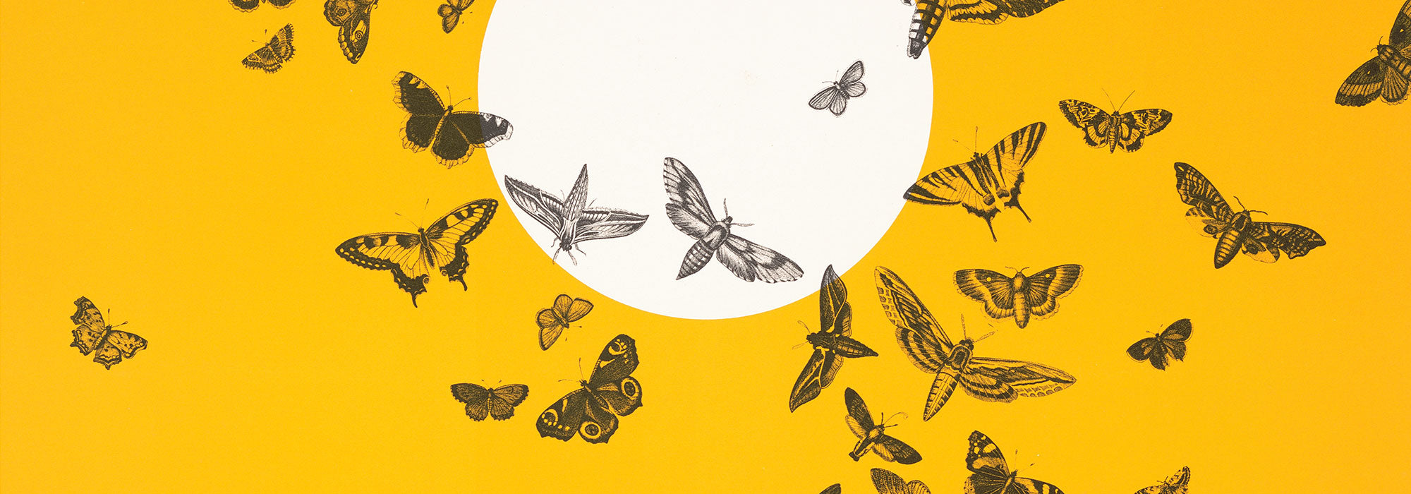
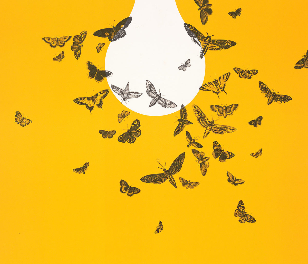
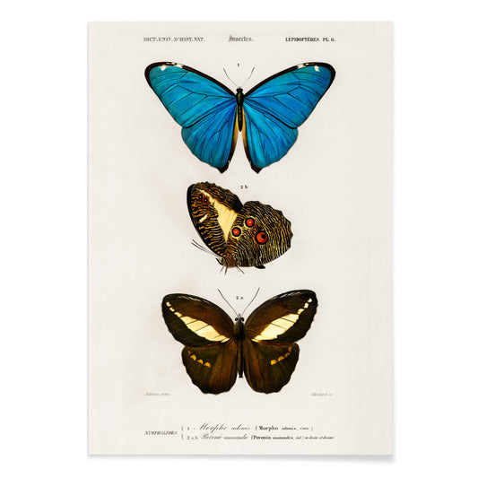
Borboletas azuis e castanhas Poster
Charles Dessalines D'Orbigny · 1806 · Delicada impressão em prancha científica com borboletas de asas azuis e tons castanhos
Poster desde €9 · Emoldurado desde €16
Preço normal A partir de €6,00Preço normal -
Linum glandulosum Poster
Charles Dessalines D'Orbigny · 1847 · Delicada impressão botânica de linho-amarelo com traço preciso em papel suavemente envelhecido
Poster desde €9 · Emoldurado desde €16
Preço normal A partir de €6,00Preço normal -
Cabeça de Buda Poster
Reijer Stolk · 1943 · Serena impressão artística da cabeça de Buda com lavagens douradas e contornos suaves
Poster desde €9 · Emoldurado desde €16
Preço normal A partir de €6,00Preço normal -
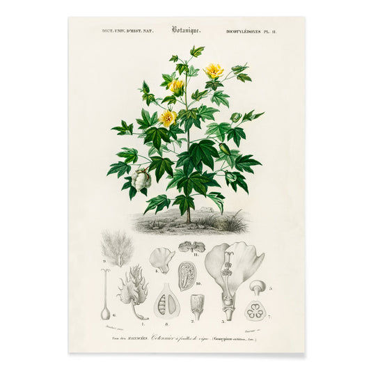
Gossypium vitifolium Poster
Charles Dessalines D'Orbigny · 1849 · Delicada impressão botânica de algodão Sea Island com folhas lobadas, flores pálidas e cápsulas
Poster desde €9 · Emoldurado desde €16
Preço normal A partir de €6,00Preço normal -
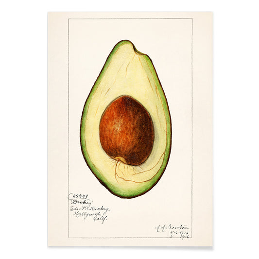
Abacate (Persea) Poster
Amanda Almira Newton · 1916 · Detalhada impressão botânica de abacate com fruto cortado, semente grande e folhas brilhantes
Poster desde €9 · Emoldurado desde €16
Preço normal A partir de €6,00Preço normal -
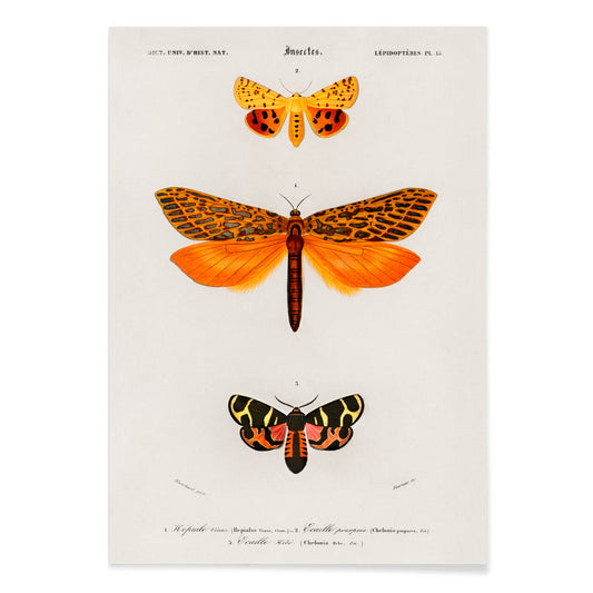
Borboletas alaranjadas Poster
Charles Dessalines D'Orbigny · 1841 · Impressão científica vibrante de borboletas alaranjadas organizada como placa de história natural precisa
Poster desde €9 · Emoldurado desde €16
Preço normal A partir de €6,00Preço normal -
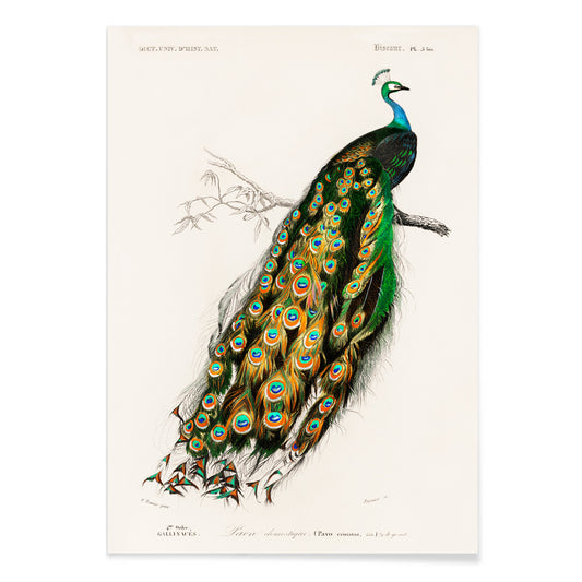
Pavo Cristatus Poster
Charles Dessalines D'Orbigny · 1849 · Elegante impressão de pavão indiano com plumagem em tons joia e detalhe naturalista refinado
Poster desde €9 · Emoldurado desde €16
Preço normal A partir de €6,00Preço normal -
Periquitos Poster
Charles Dessalines D'Orbigny · 1876 · Impressão de periquitos vibrantes com pormenores naturalistas nítidos
Poster desde €9 · Emoldurado desde €16
Preço normal A partir de €6,00Preço normal -
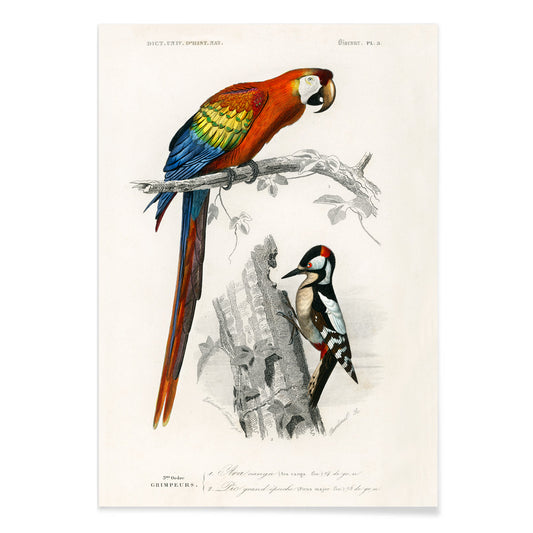
Papagaios Poster
Charles Dessalines d'Orbigny · 1841 · Impressão vívida de papagaios com aves elegantes sobre um ramo e detalhe naturalista nítido
Poster desde €9 · Emoldurado desde €16
Preço normal A partir de €6,00Preço normal -
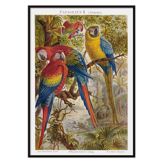
Papagaios II Poster
Institut of Leipzig · 1895 · Rica impressão com três araras empoleiradas em ramos tropicais
Poster desde €9 · Emoldurado desde €16
Preço normal A partir de €6,00Preço normal -
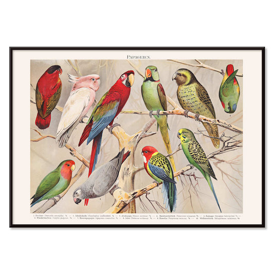
Papagaios I Poster
Institut of Leipzig · 1972 · Poster vibrante de papagaios organizado como placa de história natural com detalhe científico nítido
Poster desde €9 · Emoldurado desde €16
Preço normal A partir de €6,00Preço normal -
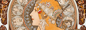
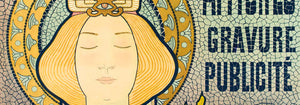
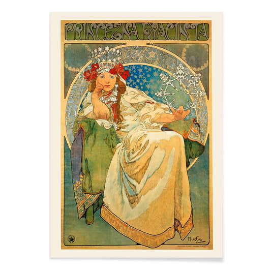
Princezna Hyacinta Poster
Alfons Mucha · 1911 · Elegante poster Art Nouveau de uma princesa coroada emoldurada por ornamentos florais
Poster desde €9 · Emoldurado desde €16
Preço normal A partir de €6,00Preço normal -
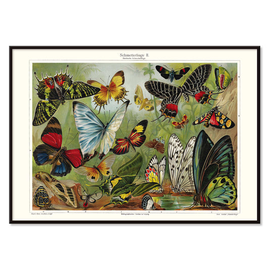
Borboletas II Poster
Institut of Leipzig · 1971 · Poster vintage de borboletas com exemplares coloridos dispostos numa exibição educativa precisa
Poster desde €9 · Emoldurado desde €16
Preço normal A partir de €6,00Preço normal -
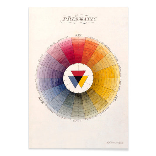
Roda cromática prismática Poster
Moses Harris · 1766 · Roda cromática iluminista em poster com tons primários e secundários radiantes dispostos com precisão
Poster desde €9 · Emoldurado desde €16
Preço normal A partir de €6,00Preço normal -
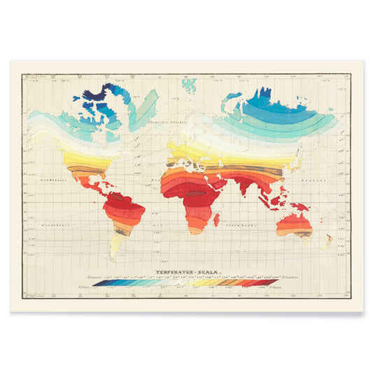
Mapa Mundial de Temperaturas Poster
Wilhelm Ebel · 1850 · Detalhada impressão vintage de temperaturas mundiais com bandas de gradiente suave
Poster desde €9 · Emoldurado desde €16
Preço normal A partir de €6,00Preço normal -
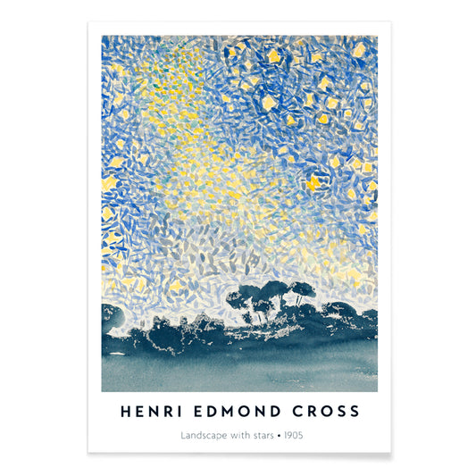
Paisagem com Estrelas Poster
Henri-Edmond Cross · 1907 · Impressão artística pontilhista de paisagem noturna com estrelas cintilantes e atmosfera mediterrânea serena
Poster desde €9 · Emoldurado desde €16
Preço normal A partir de €6,00Preço normal -
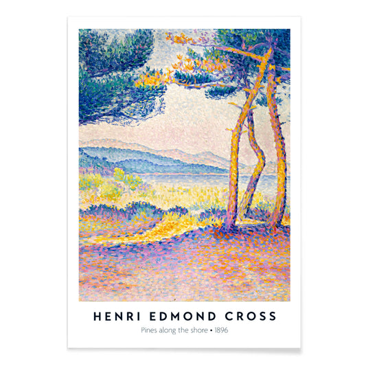
Pinheiros junto à costa Poster
Henri-Edmond Cross · 1896 · Luminosa impressão artística pontilhista de praia com pinheiros, falésias e mar azul cintilante
Poster desde €9 · Emoldurado desde €16
Preço normal A partir de €6,00Preço normal -
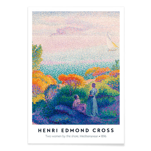
Duas Mulheres à Beira-Mar Poster
Henri-Edmond Cross · 1896 · Radiante impressão artística à beira-mar com duas mulheres, luz cintilante e horizontes serenos
Poster desde €9 · Emoldurado desde €16
Preço normal A partir de €6,00Preço normal -
Calanque des Antibois Poster
Henri-Edmond Cross · 1891 · Impressão artística neo-impressionista costeira com mar azul cintilante, rochas quentes e luz de verão
Poster desde €9 · Emoldurado desde €16
Preço normal A partir de €6,00Preço normal -
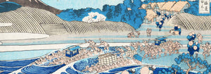
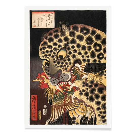
Tigre de Ryokoku Poster
Utagawa Hirokage · 1860 · Dramática impressão artística ukiyo-e de um tigre capturando um galo sob caligrafia marcante
Poster desde €9 · Emoldurado desde €16
Preço normal A partir de €6,00Preço normal -
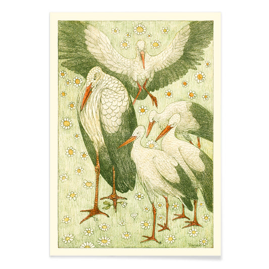
Cinco cegonhas num prado Poster
Theo van Hoytema · 1898 · Serena impressão de cegonha num prado com linhas leves e verdes suaves
Poster desde €9 · Emoldurado desde €16
Preço normal A partir de €6,00Preço normal -
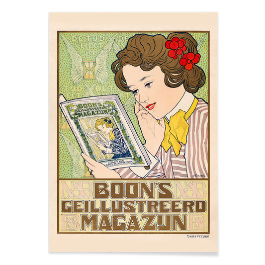
Boon Poster
Johann Georg van Caspel · 1904 · Poster Art Nouveau de mulher a ler emoldurada por flores sinuosas
Poster desde €9 · Emoldurado desde €16
Preço normal A partir de €6,00Preço normal -
Capi Poster
Johann Georg van Caspel · 1912 · Elegante poster Art Nouveau com mulher segurando uma câmara e acentos azuis marcantes
Poster desde €9 · Emoldurado desde €16
Preço normal A partir de €6,00Preço normal -
Ivens & Co. Poster
Johann Georg van Caspel · 1899 · Poster Art Nouveau com câmara elegante e contrastes nítidos em azul e amarelo
Poster desde €9 · Emoldurado desde €16
Preço normal A partir de €6,00Preço normal -
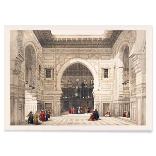
Interior da Mesquita do Sultão Ghoree Poster
David Roberts · 1839 · Interior atmosférico de mesquita com arcos altivos, luz suave e figuras serenas
Poster desde €9 · Emoldurado desde €16
Preço normal A partir de €6,00Preço normal -
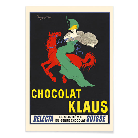
Chocolat Klaus Poster
Leonetto Cappiello · 1903 · Poster com cavalo vermelho marcante e cavaleira de verde em forte contraste Belle Époque
Poster desde €9 · Emoldurado desde €16
Preço normal A partir de €6,00Preço normal -
Vegetaline Poster
Leonetto Cappiello · 1910 · Cozinheiro divertido montado num elefante vermelho num poster publicitário francês arrojado
Poster desde €9 · Emoldurado desde €16
Preço normal A partir de €6,00Preço normal -
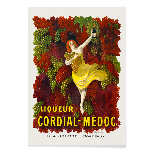
Cordial-Médoc Poster
Leonetto Cappiello · 1907 · Alegre poster de licor com dançarina vestida de amarelo e cachos de uvas
Poster desde €9 · Emoldurado desde €16
Preço normal A partir de €6,00Preço normal -
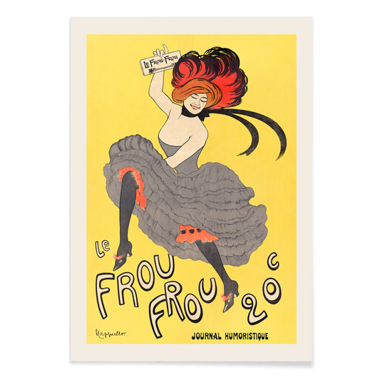
Le Frou Frou Poster
Leonetto Cappiello · 1899 · Poster vibrante com dançarina de cancan, tipografia ousada e energia da Belle Époque
Poster desde €9 · Emoldurado desde €16
Preço normal A partir de €6,00Preço normal


36/706 items
- Rythme n°2 Poster
- Rythme n°3 Poster
- Os Últimos Dias de Pompeia Poster
- Valles Marineris Poster
- Chocolat Menier Poster
- Phobos e Deimos Poster
- Olympus Mons Poster
- Roda cromática prismática Poster
- Paisagem com Estrelas Poster
- Pinheiros junto à costa Poster
- Duas Mulheres à Beira-Mar Poster
- Calanque des Antibois Poster
- Tigre de Ryokoku Poster
- Boon Poster
- Vegetaline Poster
Um fio amarelo pela história da arte
Esta colecção não fala de monocromia. Acompanha o modo como o amarelo actua quando entra numa imagem: ora como luz, ora como sinal, ora como ornamento, ora como um sopro breve de energia. Nos cartazes vintage destaca-se nas fachadas e vitrinas; na pintura moderna converte-se em estrutura; nos livros e ilustrações de história natural sugere pólen, casca e papel amarelado pelo sol. Lea estes posters e gravuras como um vocabulário de calor, que vai desde reflexos amanteigados até notas eléctricas que alteram a temperatura do conjunto.
Dourado, citrinos e a lógica da cor
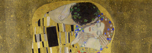
Poucas obras demonstram o amarelo como técnica e luxo com tanta clareza como The Kiss (1907–1908) de Gustav Klimt, onde os amarelos metálicos funcionam como tesselas que transformam a pintura em superfície simbólica. No outro extremo, o Cercle chromatique de Michel Eugène Chevreul trata a cor como um dado mensurável, um diagrama científico que continua a servir de referência decorativa. Juntos explicam porque o amarelo atravessa épocas: pode sinalizar opulência, iluminar um ponto focal ou fornecer um princípio de ordem visual, tornando uma impressão vintage imediata e intelectualmente sustentada.
Usar acentos amarelos na decoração
Na decoração, o amarelo resulta melhor quando tem uma função definida. Um corredor estreito ganha com um lampejo perto de um espelho; uma cozinha beneficia de amarelos que evocam citrinos ou grãos; um escritório aceita tons mais nítidos e analíticos. Combine posters amarelos com brancos suaves, nogueira e linho para um calor discreto, ou sobreponha-os a verdes profundos e azuis à tinta-da-china para um contraste dramático. Para contenção e geometria, alterne entre Minimalista e Abstrato; para contrapontos naturais, Botânica ancora a cor em folhas, hastes e estudos de campo.
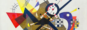
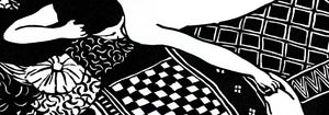
Curar uma parede de galeria com padrão e estrutura
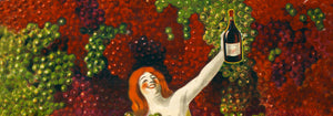
Ao montar uma parede de galeria, pense em ritmos: padrão, grelha, depois uma nota vívida. Strawberry Thief (1883) de William Morris traz densidade têxtil e lógica de jardim que suaviza mobiliário contemporâneo. Equilibre com Composition in White, Red, and Yellow (1936) de Piet Mondrian, onde o amarelo actua como plano medido em vez de atmosfera. Introduza dinamismo controlado com Circles in a circle, Bauhaus exhibition (1923) de Wassily Kandinsky, ponte entre cartaz e pintura. Para maior variedade, Publicidade privilegia tipografia vigorosa, Bauhaus reforça o rigor formal, e Arte Clássica oferece âncoras tonais contidas.
Por que o amarelo parece tão presente
O amarelo é por vezes subestimado como mera cor decorativa, mas frequentemente é uma estratégia composicional: guia o olhar, sugere luz solar ou mapeia um sistema visual. Pendure um pequeno traço amarelo com intenção e verá as cores envolventes lerem-se mais limpas ou mais profundas, como se a luz do espaço tivesse sido ajustada sem alterar a lâmpada. Esta colecção reúne posters, impressões e gravuras que usam o amarelo não só como acento cromático, mas como ideia — um detalhe que organiza e enriquece a parede.